Overview
PROBLEM
Although widely used, there is no systematic way of defining, using, or naming tags. This creates confusion for users and makes it difficult for product teams to solve problems.
OPPORTUNITY
To codify and create consistency of all the user scenarios for the component and help designers achieve velocity to create high-quality product experiences.
ROLE
Lead Designer |Research & audit, workshop, visual design, documentation, testing
DESIGN SYSTEM CASE STUDY
Challenge
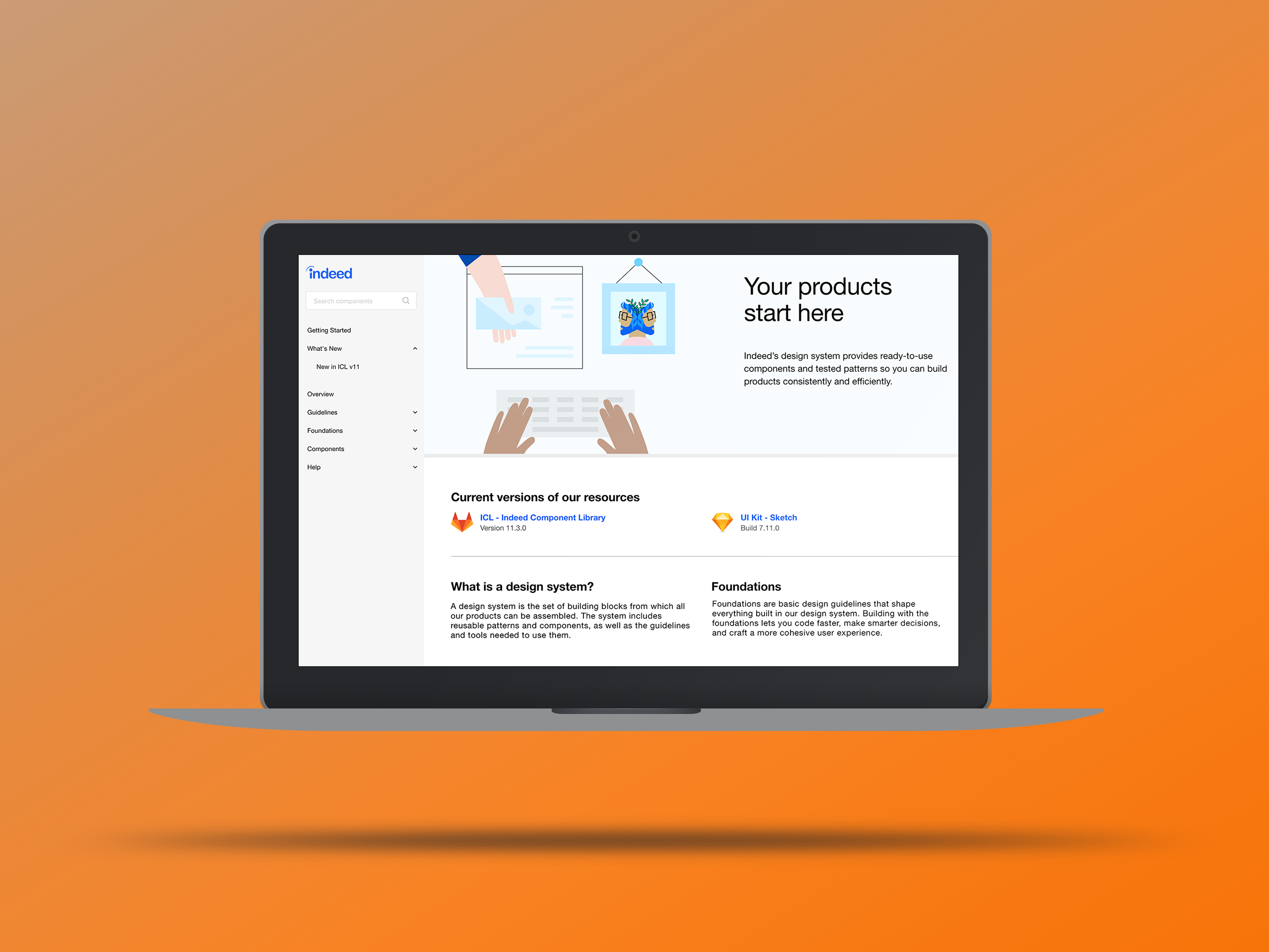
When asked what the designers of the UX org thought of Indeed's design system, they understood the importance and used it as a starting point but at its current state, but pointed out it didn’t meet all their needs and many found it inflexible.
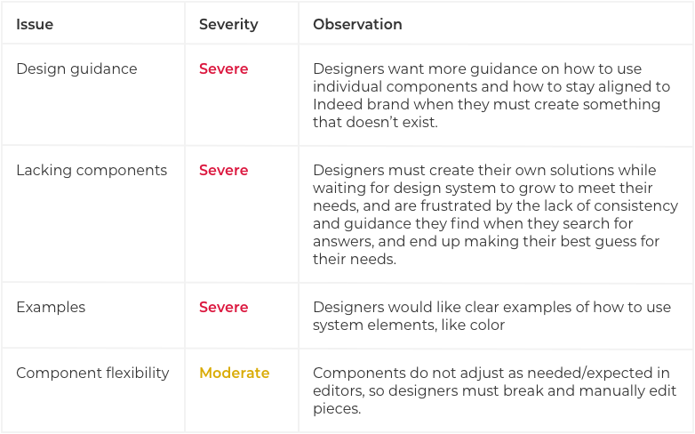
The results of the research study showed that there was a high demand and need for design guidance on how to use individual components, designing missing components so designers don’t have to spend more time and resources on creating their own, and component flexibility to adjust to product-specific use cases.
Discovery
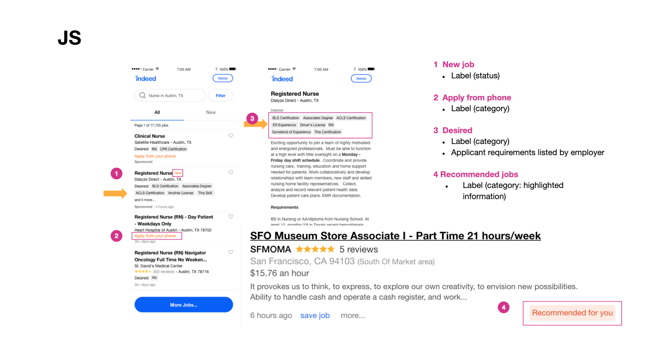
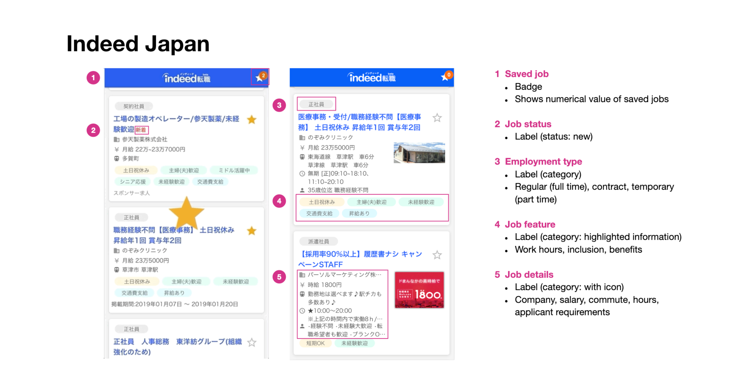
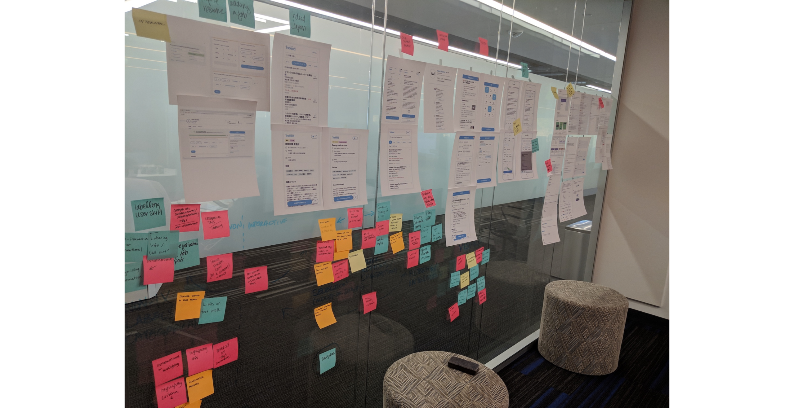
The word "tag" was already a loaded term that had different definitions depending on where I looked or who I spoke to. I conducted an audit collecting all the use cases within Indeed's products and found various use cases and visual variations. Even in my competitive analysis of other design systems, I found the nomenclature, definitions, and usage guidelines varied.
Seeing all these inconsistencies that revolved around this component, I was able to empathize with the product designers that faced the difficulties in selecting a direction to follow resulting in churn.
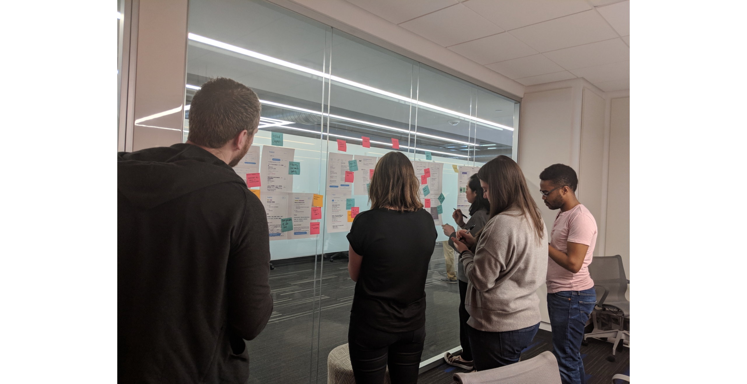
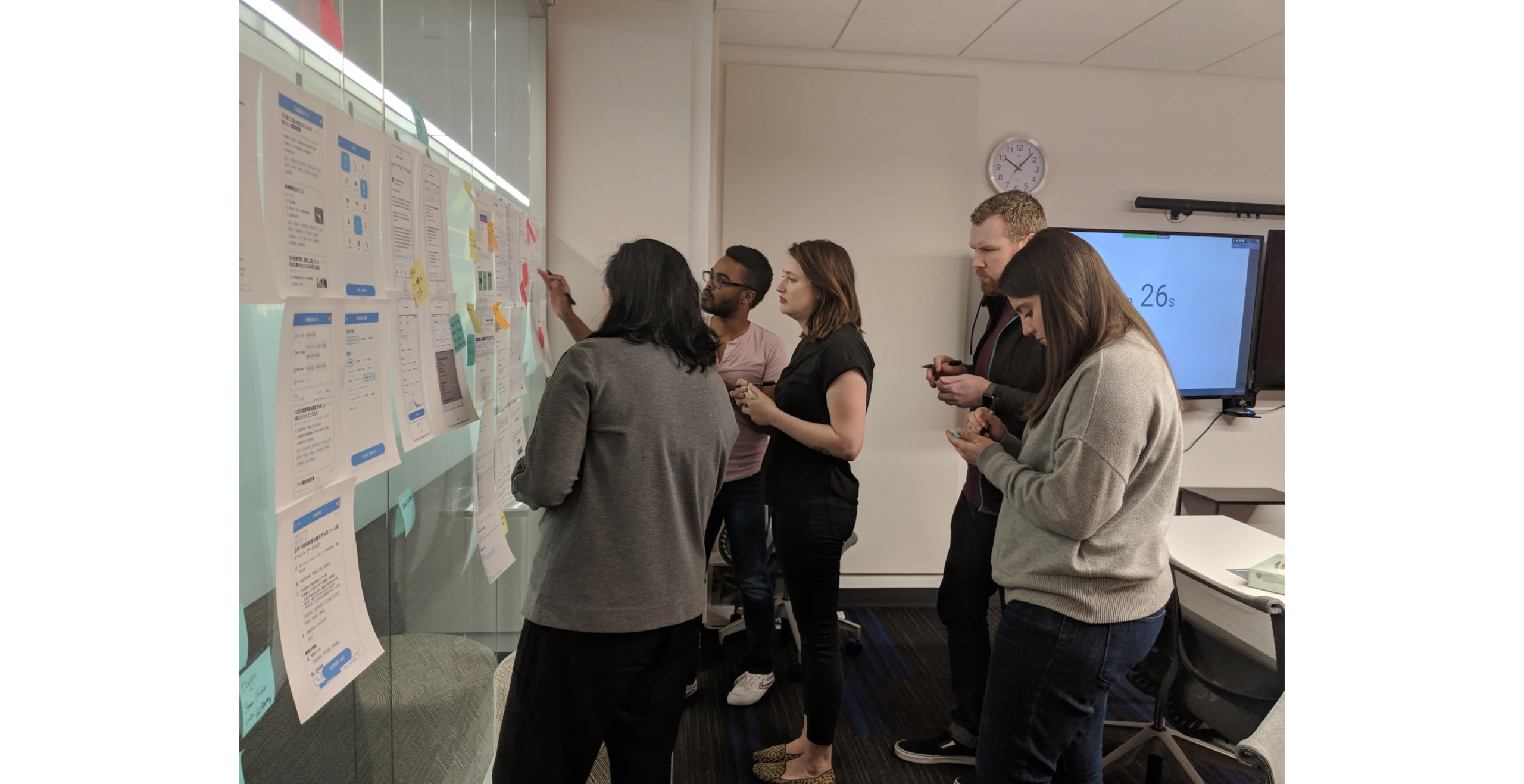
Workshop
For more insight and context from my research I decided to conduct design workshops to clarify the different purposes and use cases within a tag system and derive a defining family and visual style.
ACTIVITIES
- Lightning Demos: Identify tags within internal and external products
- Crazy 8's: Quick sketches based on notes and group conversation
- Solution Sketch: Detailed sketches providing solutions based on previous activities and group discussions
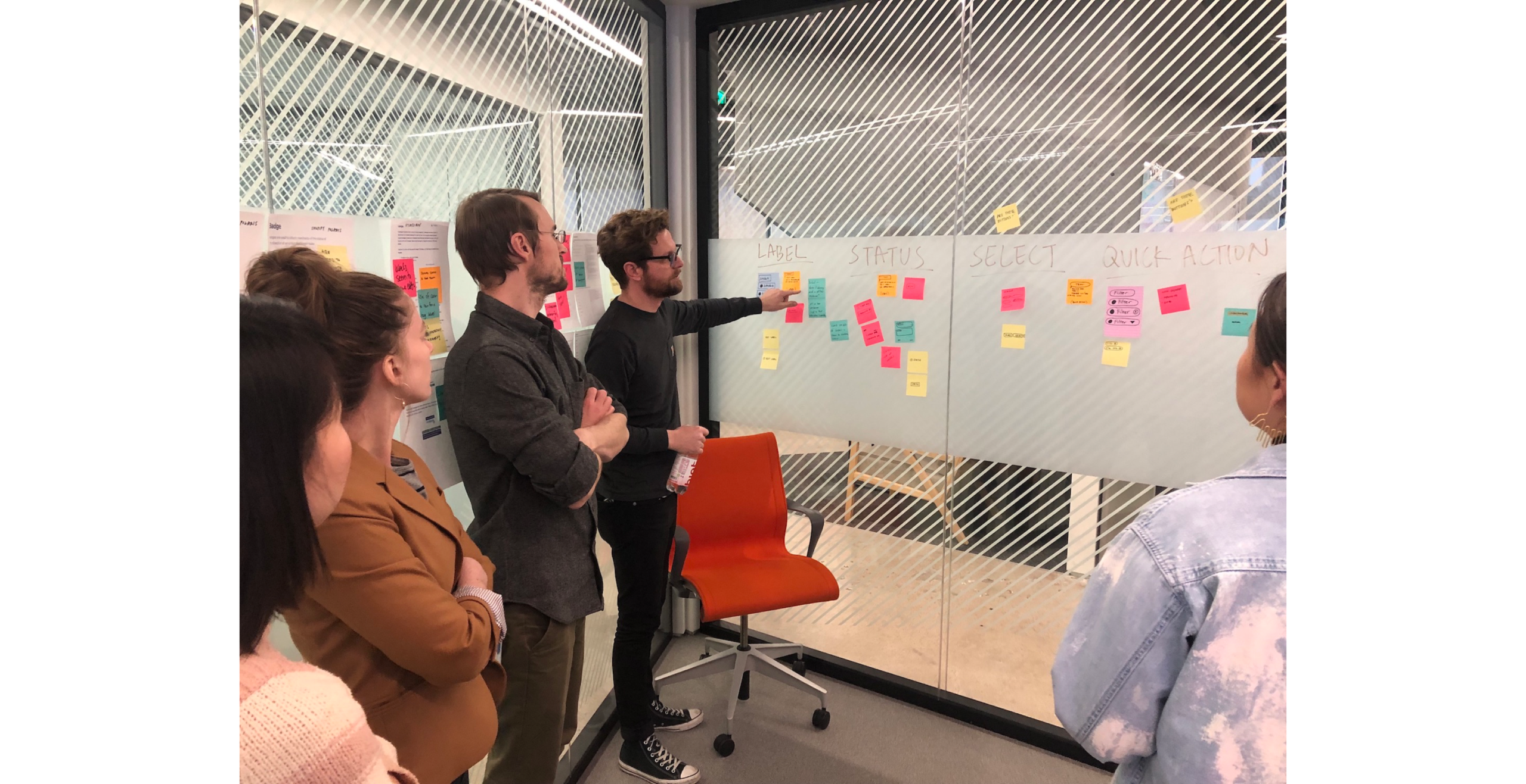
OUTCOME
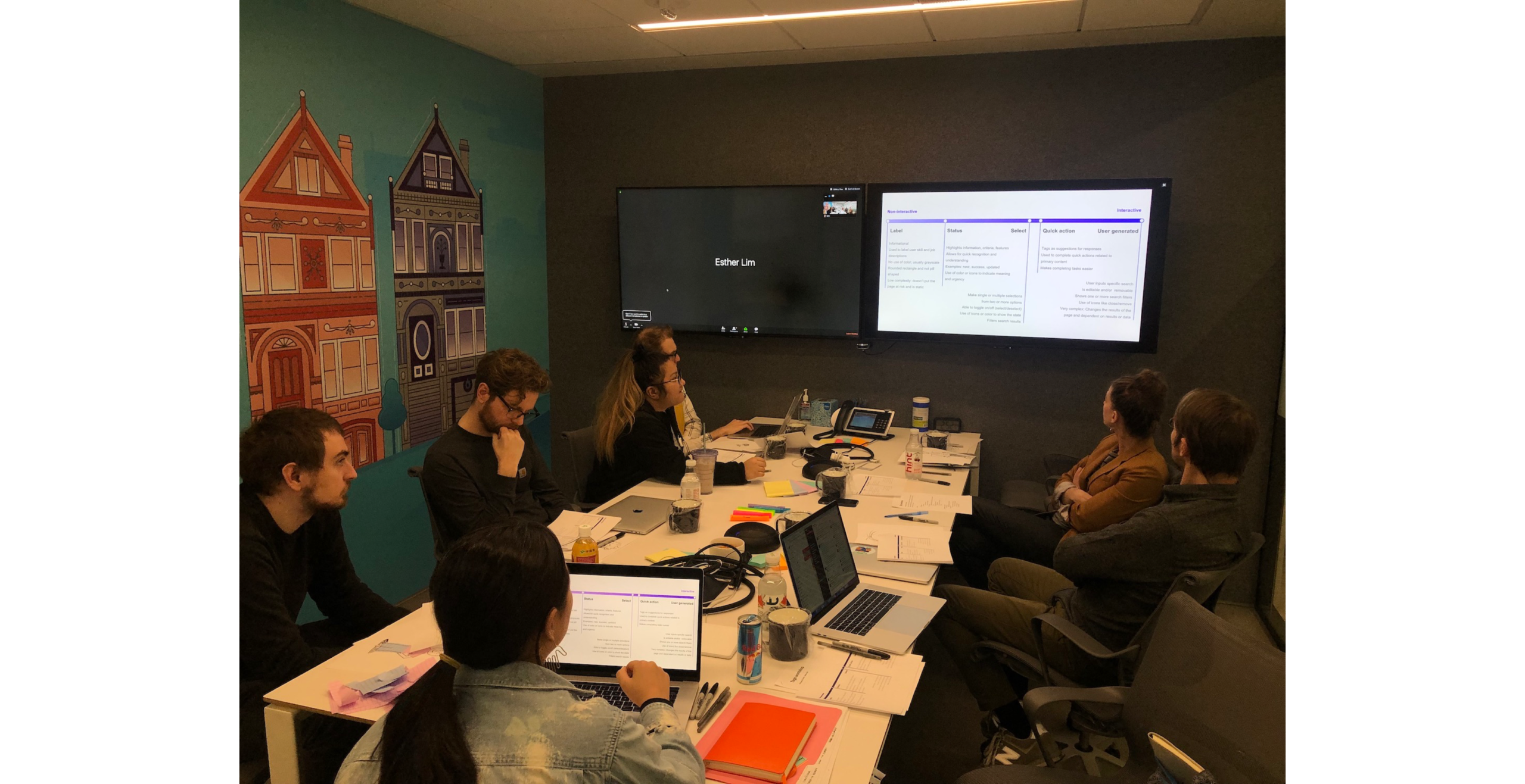
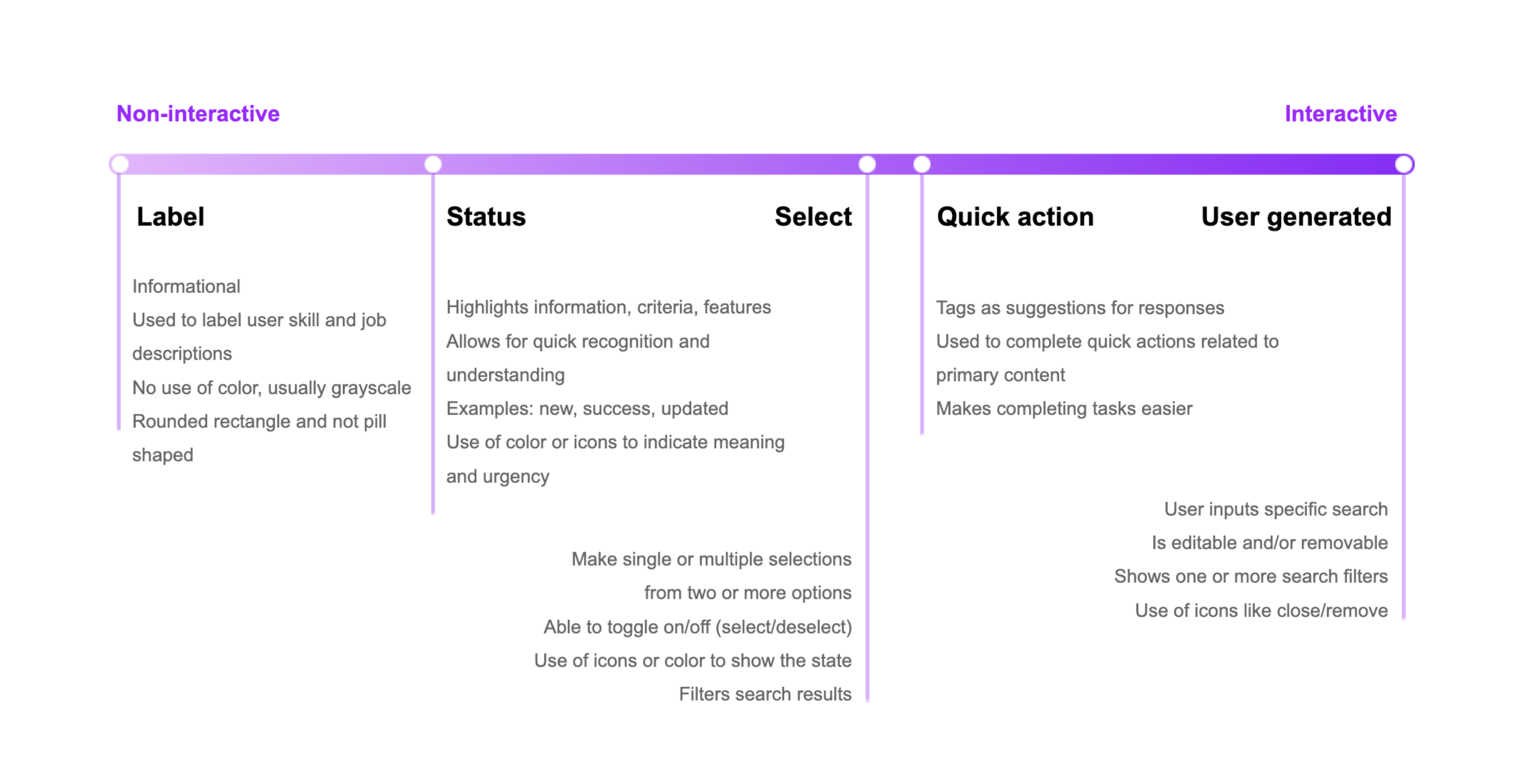
Various use cases and types of tags were established within the system and sorted from non-interactive to interactive based on user interaction and visual hierarchy and tags were defined as visual displays of information in a small amount of space.
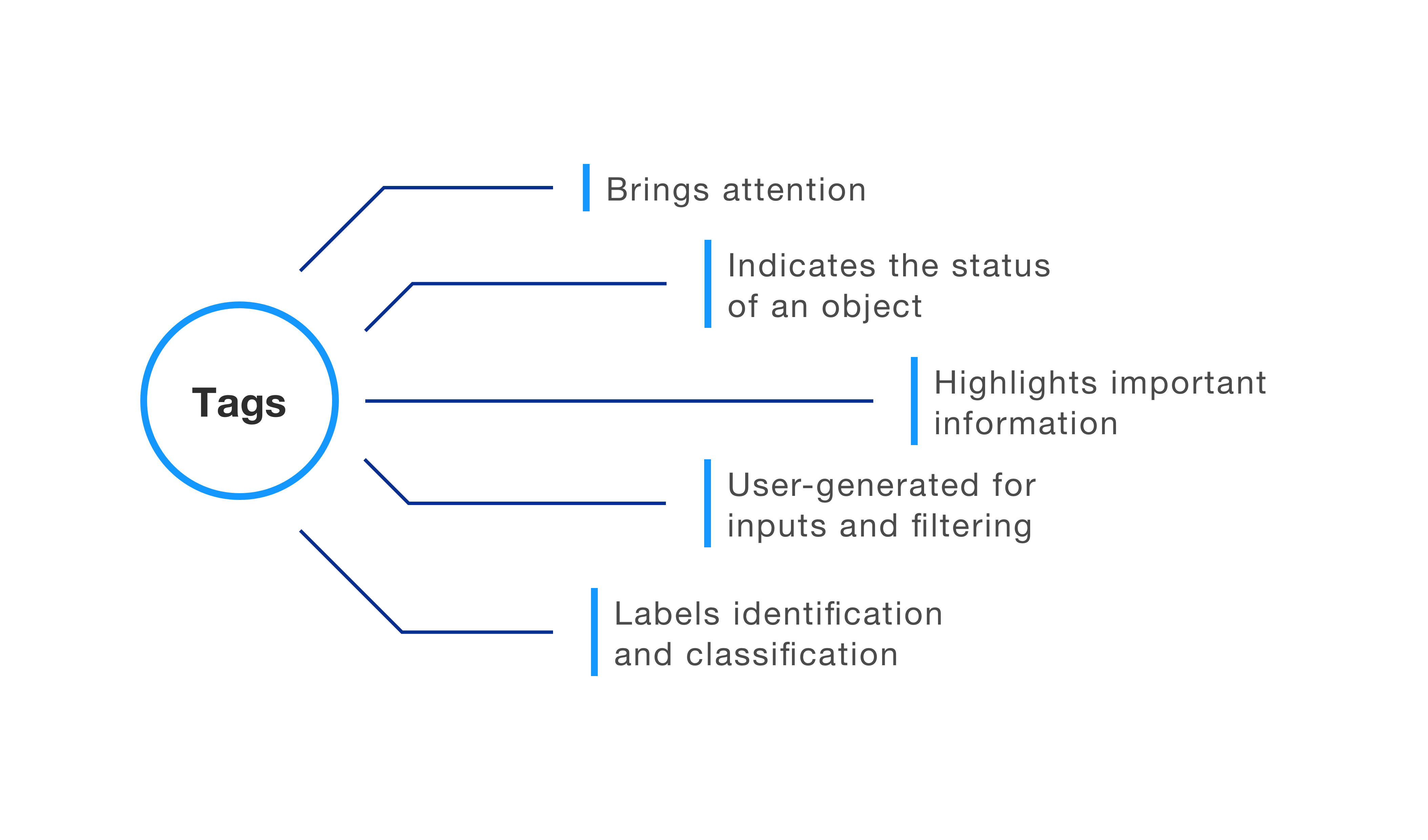
What is a tag and what does it solve for?
Solution
Along with any design solutions, I wanted to make sure the challenges and user issues were addressed. The components had to be flexible enough to be used in product specific problems and there had to be thorough documentation with examples of usage patterns.
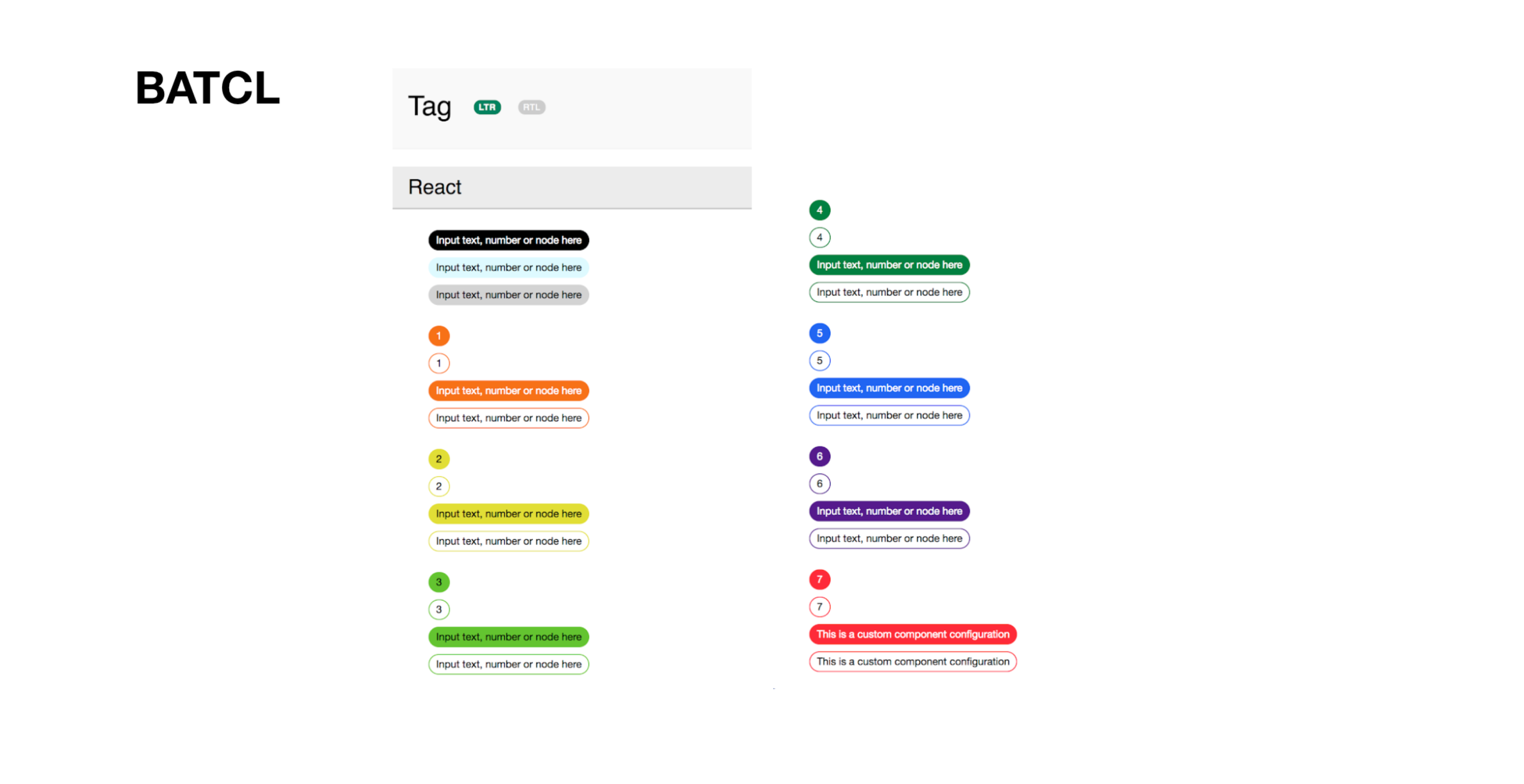
DECOMPOSED DESIGN
In response to the frustration of the inflexibility of components, the team decided to pivot the way we design components. The solution was a decomposed method that provided the simplest atomic pieces that can be assembled with others. This would help the design system avoid creating "whole" components that cater only to one specific use case that cause our users overriding the component.
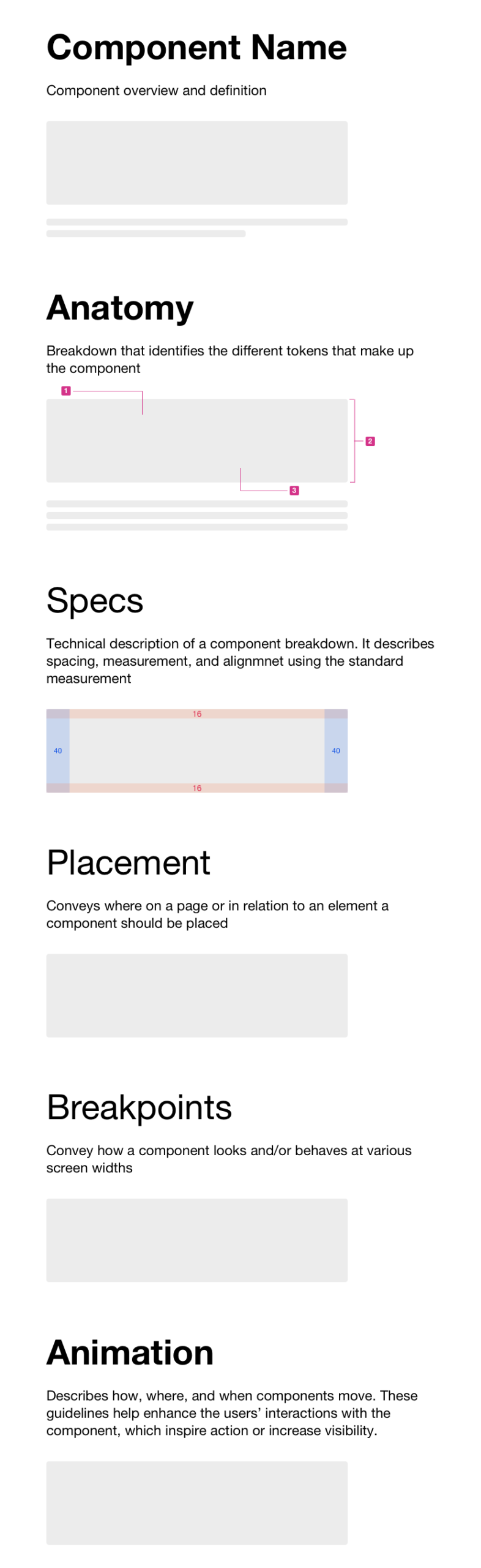
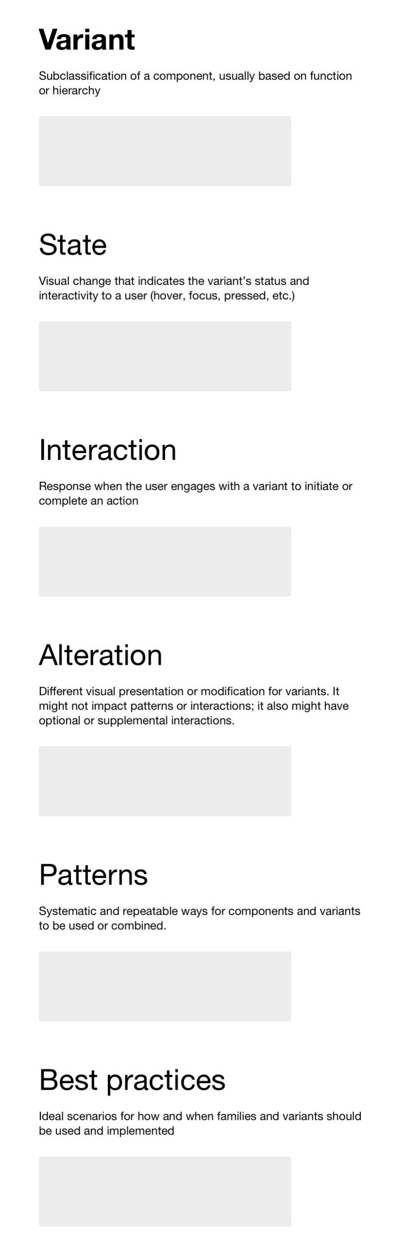
DOCUMENTATION
Along with the new design approach, we needed an appropriate layout for documentation that was flexible for all compoents.
The first portion of the documentation is a visual breakdown of the component and the second half contains information on usage guidelines, patterns, and best practices.
Components
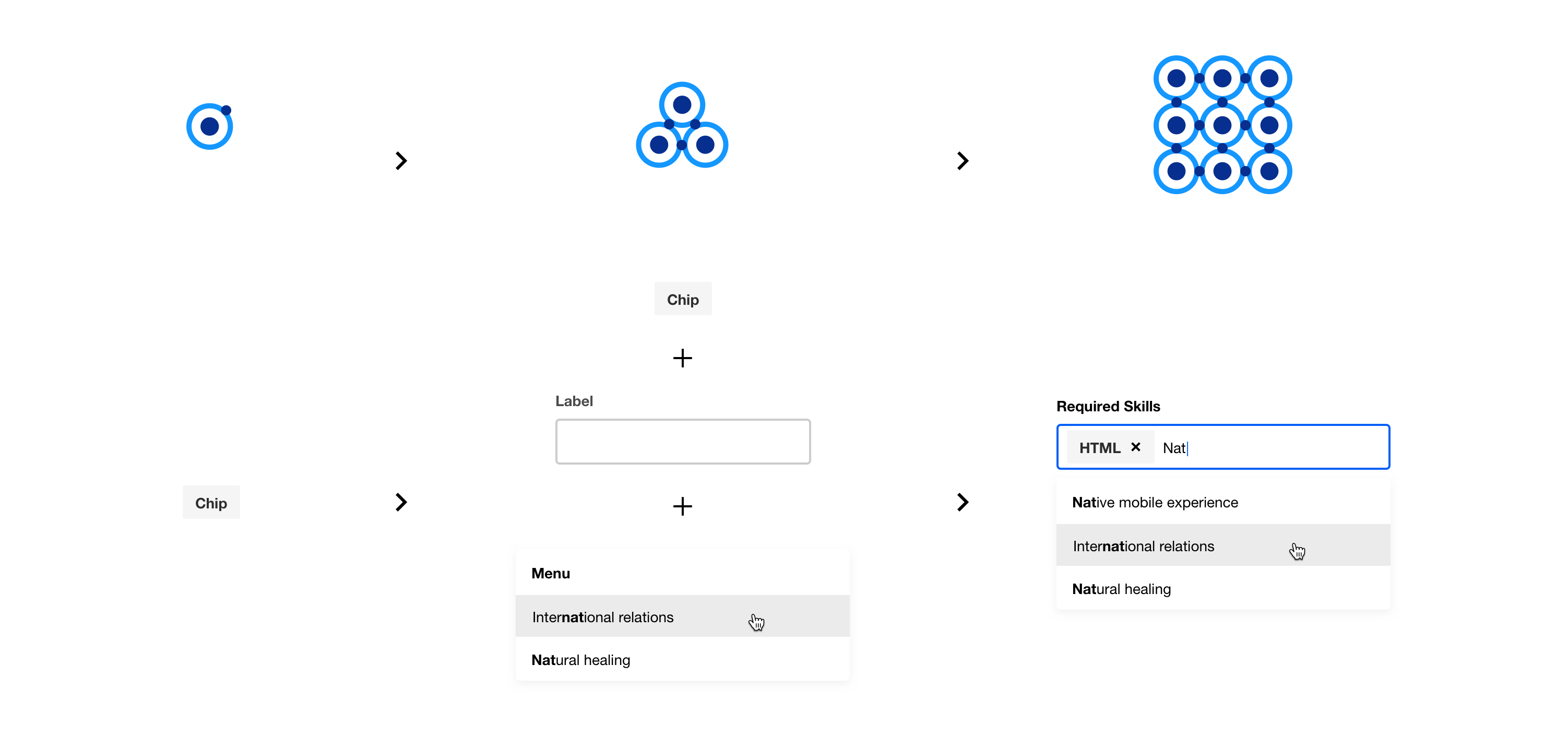
The Tags System could be broken down to three components - Chips, Labels, and Badges.
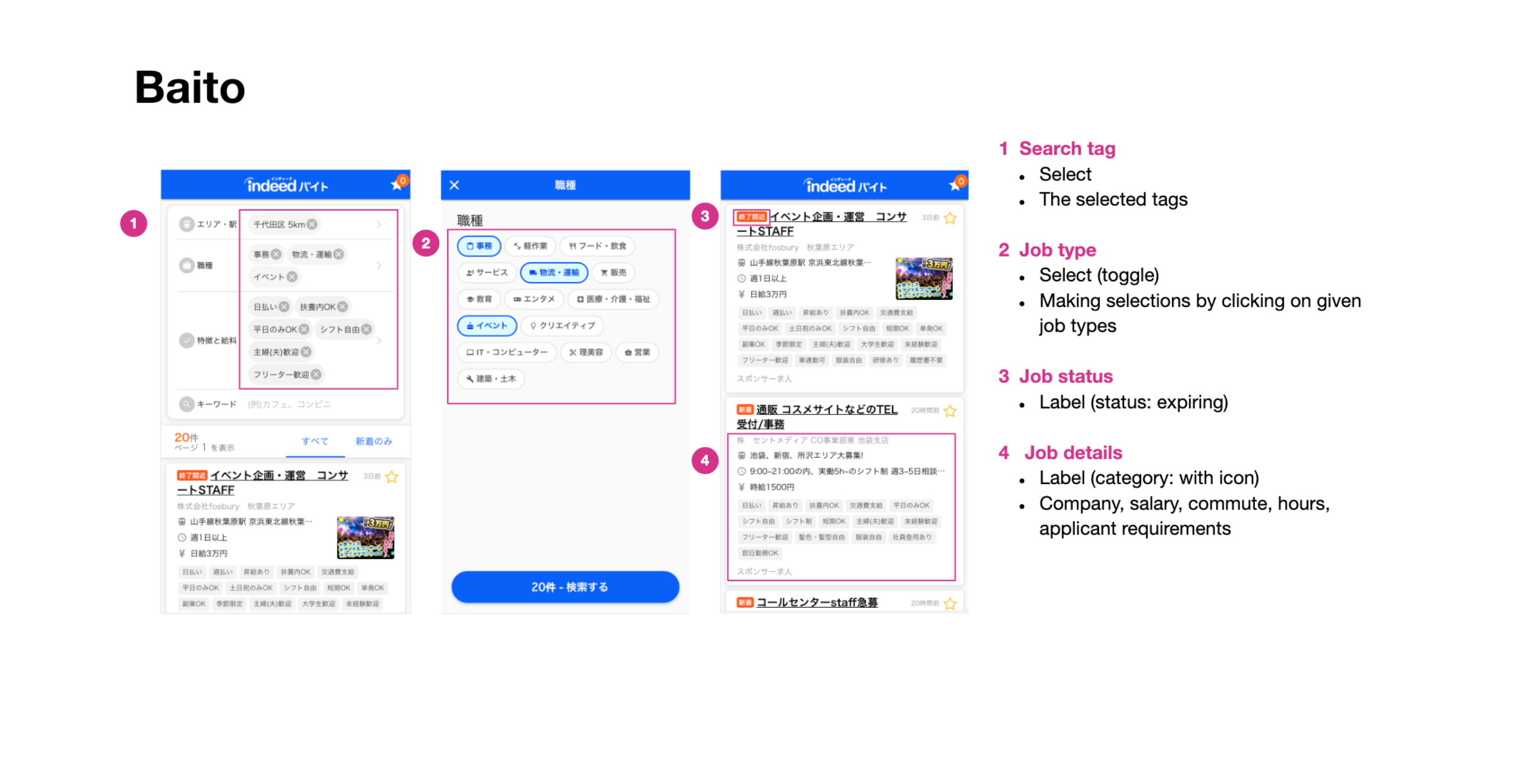
CHIPS
Chips are interactive tags that allow users to find information through filter, select, and sort interactions.
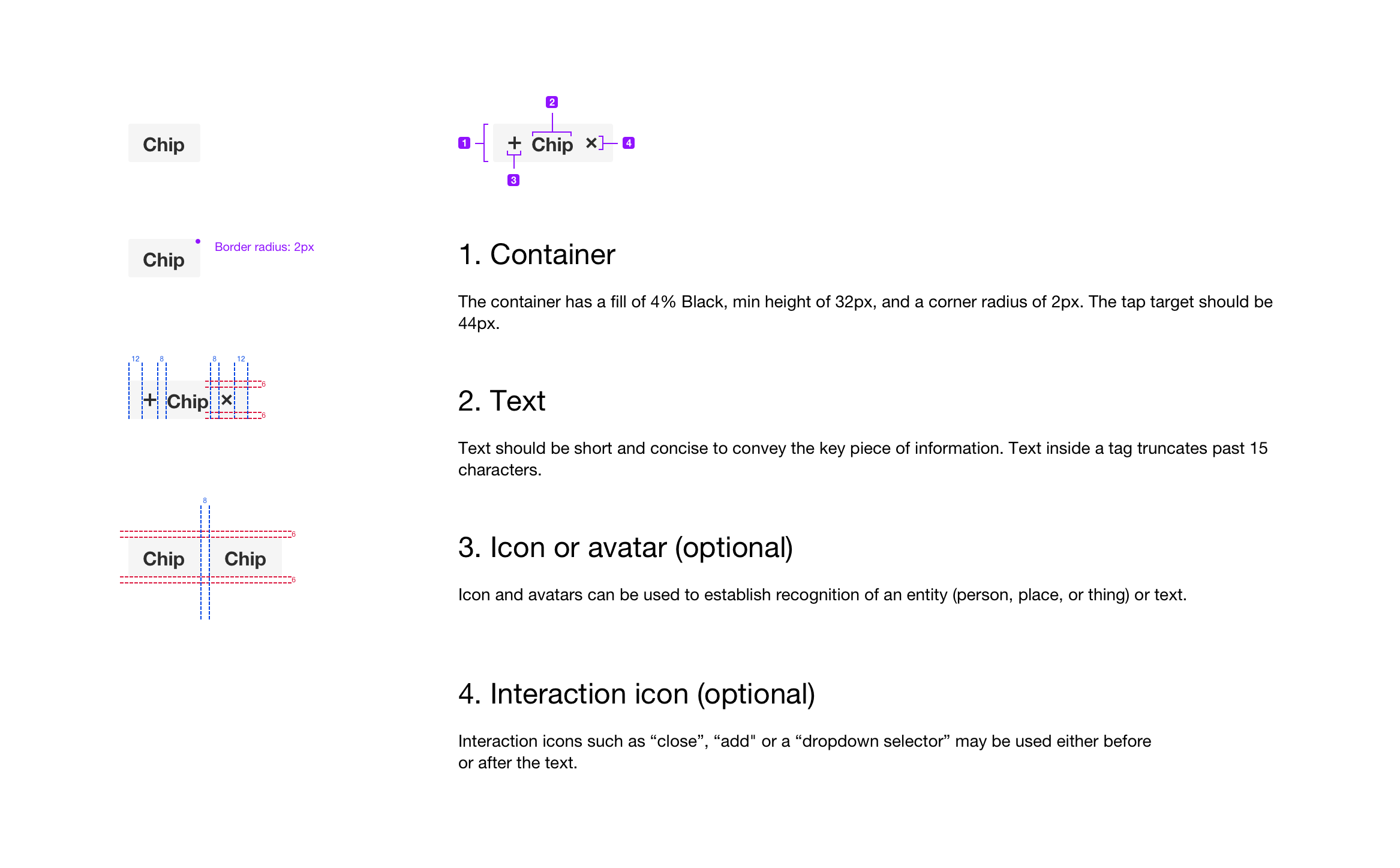
Chips have three variants based on different use cases - input, filter, and selectable.
Input
Input chips are used within input fields to create a grouping of user-generated chips. Common patterns of using input chips include the use of avatars for messaging contacts and with a close icon to establish a user-generated chip system from a dropdown list generated by autocomplete.
Filter
Filter chips are used to filter data and information. Updating the selected filter chip changes the outcome of the content. Filter chips can be used with ratings to filter job reviews by categories within company pages or in search bars to select from a menu of options to filter job results.
Selectable
Selectable chips allow users to select single or multiple items in a given list. An action or CTA is necessary for the selection to be complete. Selectable chips are a great alternative to using checkboxes especially for a long list of options and when space is limited.
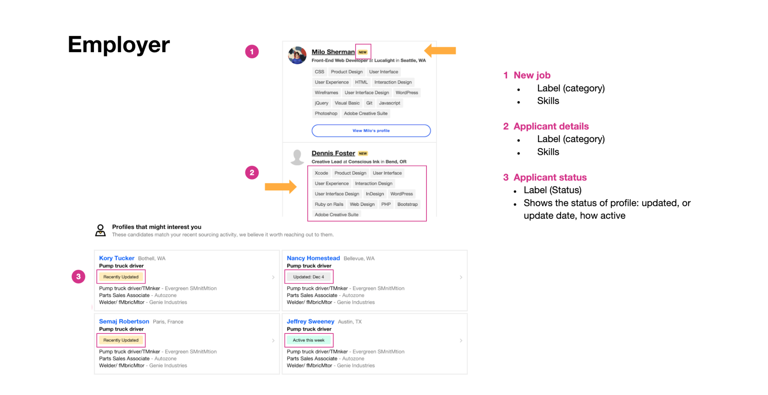
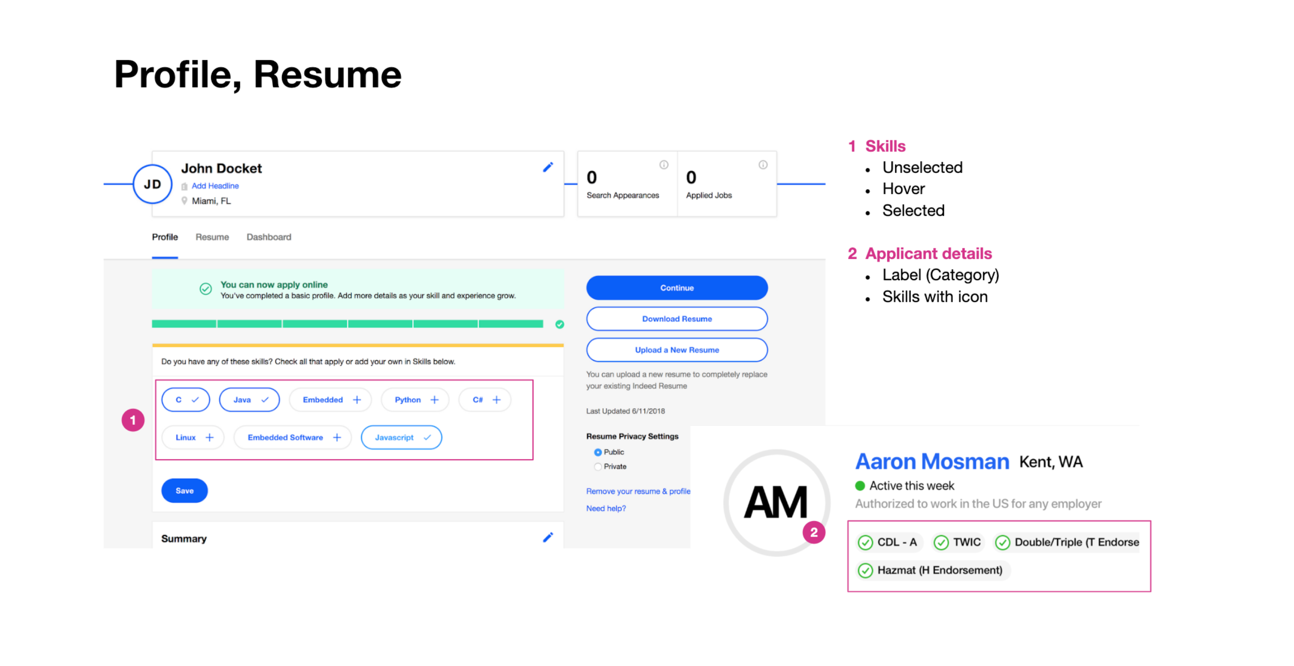
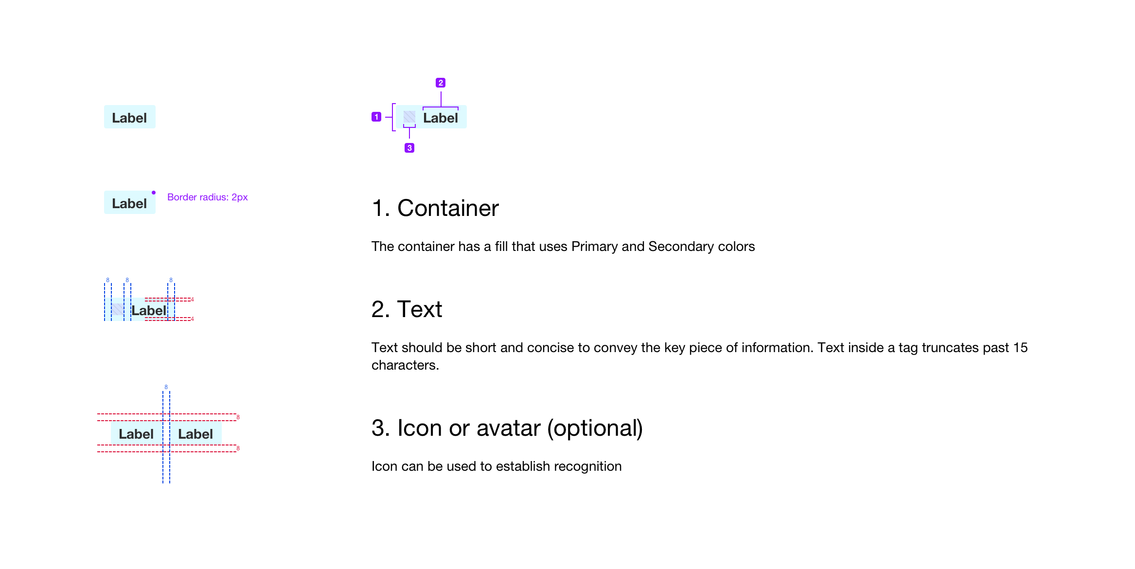
LABELS
Labels highlight information that can assist users before completing a task. They're used to convey more details or information and solely use text.
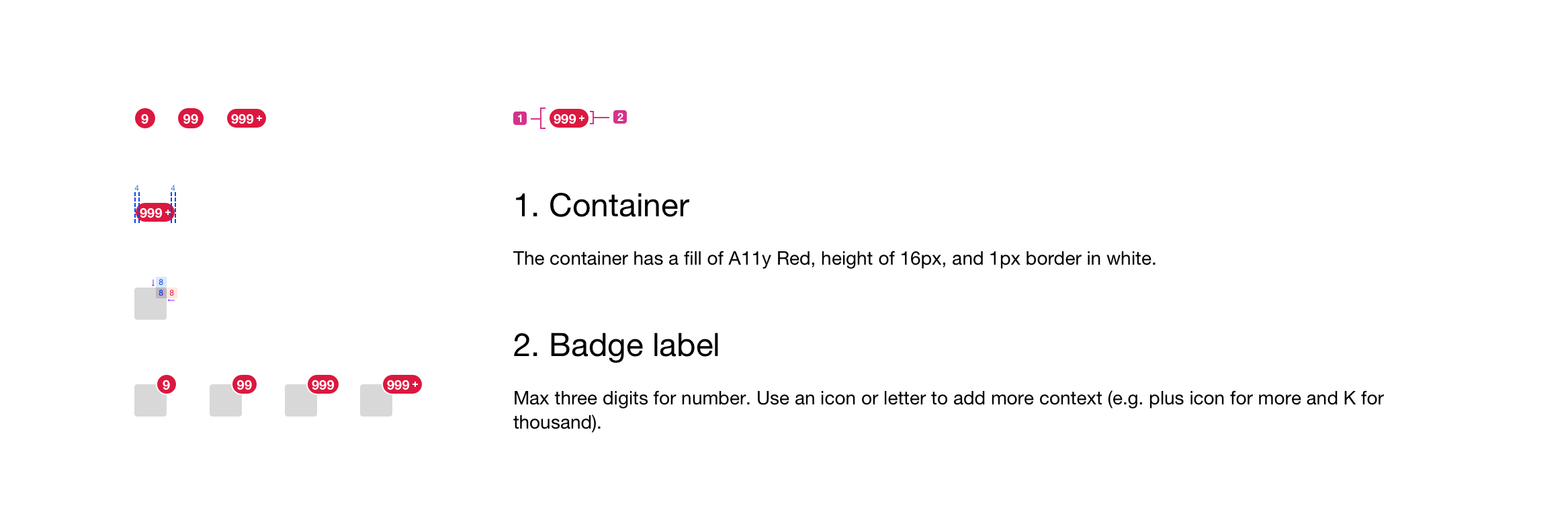
BADGES
Badges tally notifications awaiting user attention. They are a temporary, clear indication of the number of things that users might give attention to and are mostly seen within messaging where the badge is shown on the icon.
Next Steps
There is a need to validate all of the designs and findings from the research and measure customer satisfaction on the design tools and documentation by user testing with designers. After the designs are validated and codified, it would be engineered and added to the UI Kit and documentation website to be shared to product teams.
More Case Studies

View designs on Invision
OceanBox - E-commerce Website
Esther Lim
Product Designer