Overview
PROBLEM
As the product teams at Indeed grew there needed to be a way to build, design, and plan projects. With a lack of robust content, no single source of truth, or enough guidance and support, it was difficult for teams to execute projects which caused churn.
OPPORTUNITY
With a design system, product teams can work faster and create consistency which reduces tech and design debt.
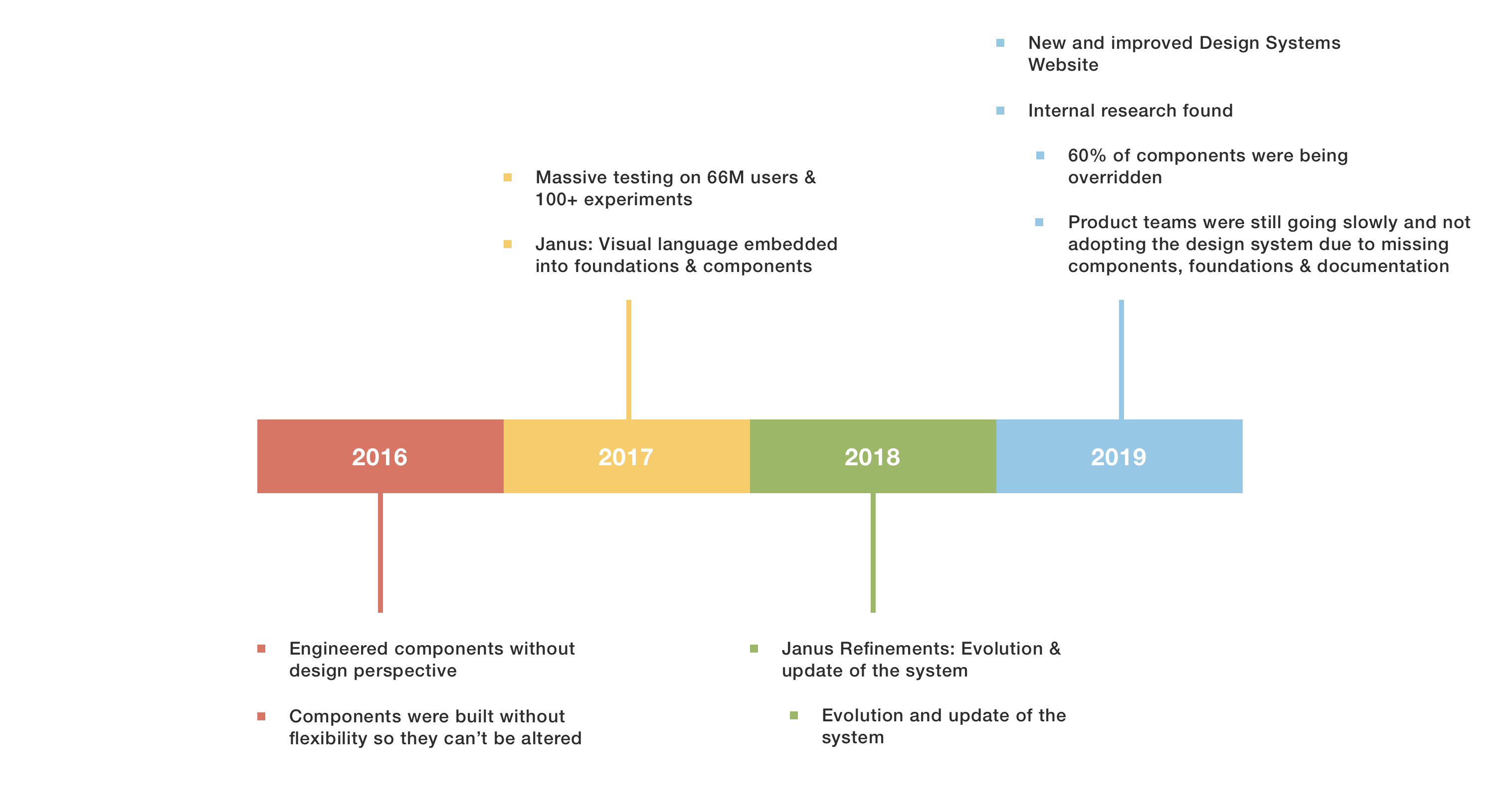
Timeline
Next steps?
The next steps for the Design System was to address the pain points that our customers addressed and find a way for people to work faster and consistently.
There had to be a better way of providing customer support on top of the Slack channels, onsite trainings, and office hours. We had to figure out how frequent and how painful the problems were and how to prioritize them as a team.
There were also missing parts to the Design System such as foundations, components, and documentation. Customers needed more guidance and patterns to apply the Design System to product specific issues.
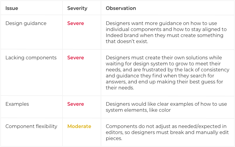
Results from a research readout to gain insight into current landscape surrounding Indeed's Design System
Journey Map
USER
EXPECTATIONS
Scenario: Product designers and engineers. Need to work faster and stay consistent to Indeed's brand identity.
UI Kit (Component Library)
ICL (Components built in code)
DSW (Documentation and guidelines)
Scope & Goals
Offer an improved Design system by providing product teams with complete foundations and components along with usage guidelines and patterns to follow.
Internal Investigation
Conducted an internal audit and problem framing collecting screens from all of Indeed's product teams.
Assumption Formulation
Design a strong set of foundations and principles as the basis for all component types along with usage guidelines for common patterns and their inteded uses, this will bring visual consistency throughout Indeed's ecosystem of products.
External Research
Some of the challenges with creating new components was the amount of time the whole process took. By doing the research and looking at exemplars from other established design systems we were able to cut the time from 12 weeks to 4 which helped in delivering more components to product teams.
Narrative Visualization
The improved design system will take existing foundations and elevate them with more documentation on usage guidelines so foundations can be used with more purpose.
An example of a foundation that lacked guidelines was colors. There were too many colors available but no direction on how to use them. This lead to inconsistency and inaccessible designs.
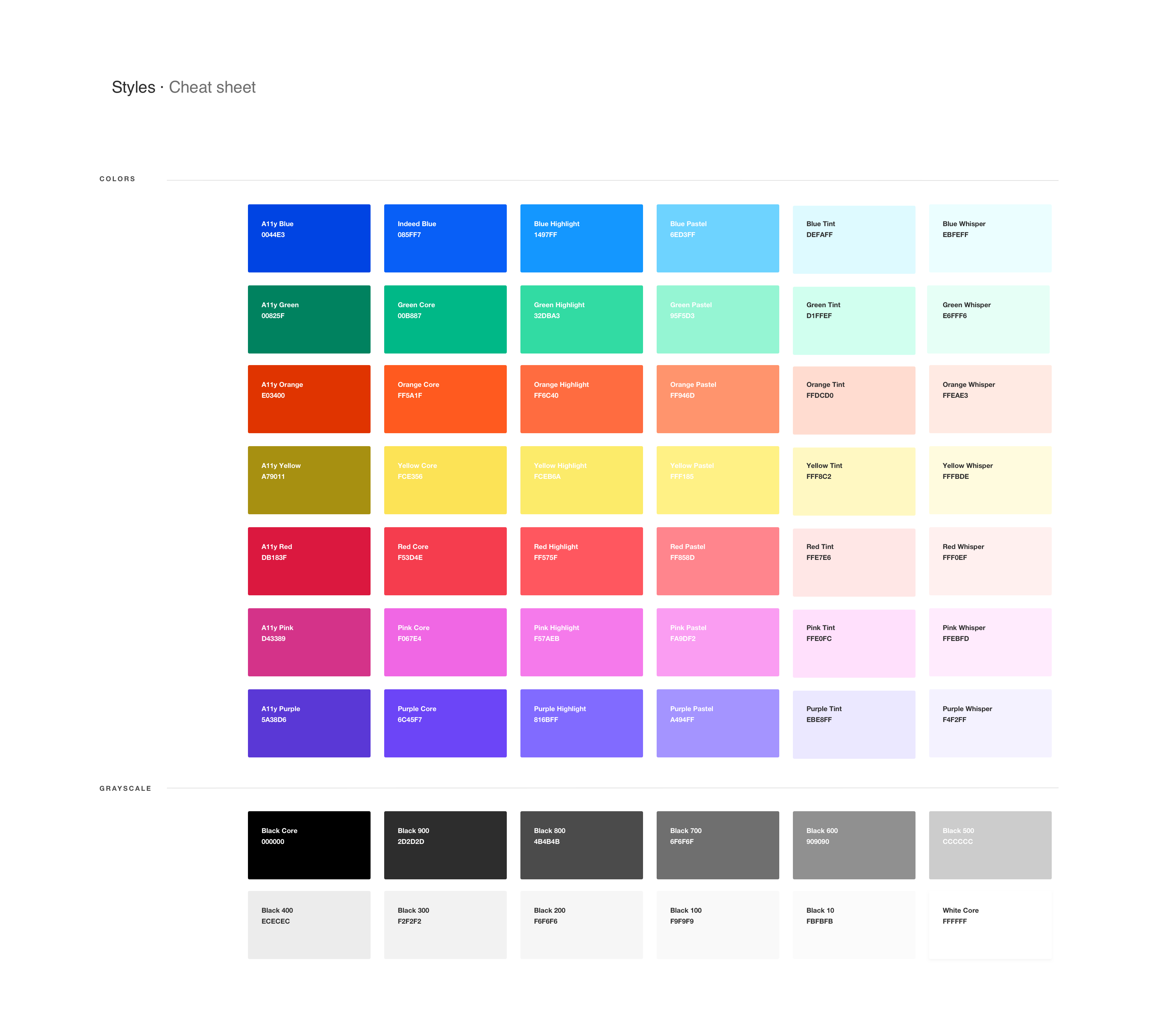
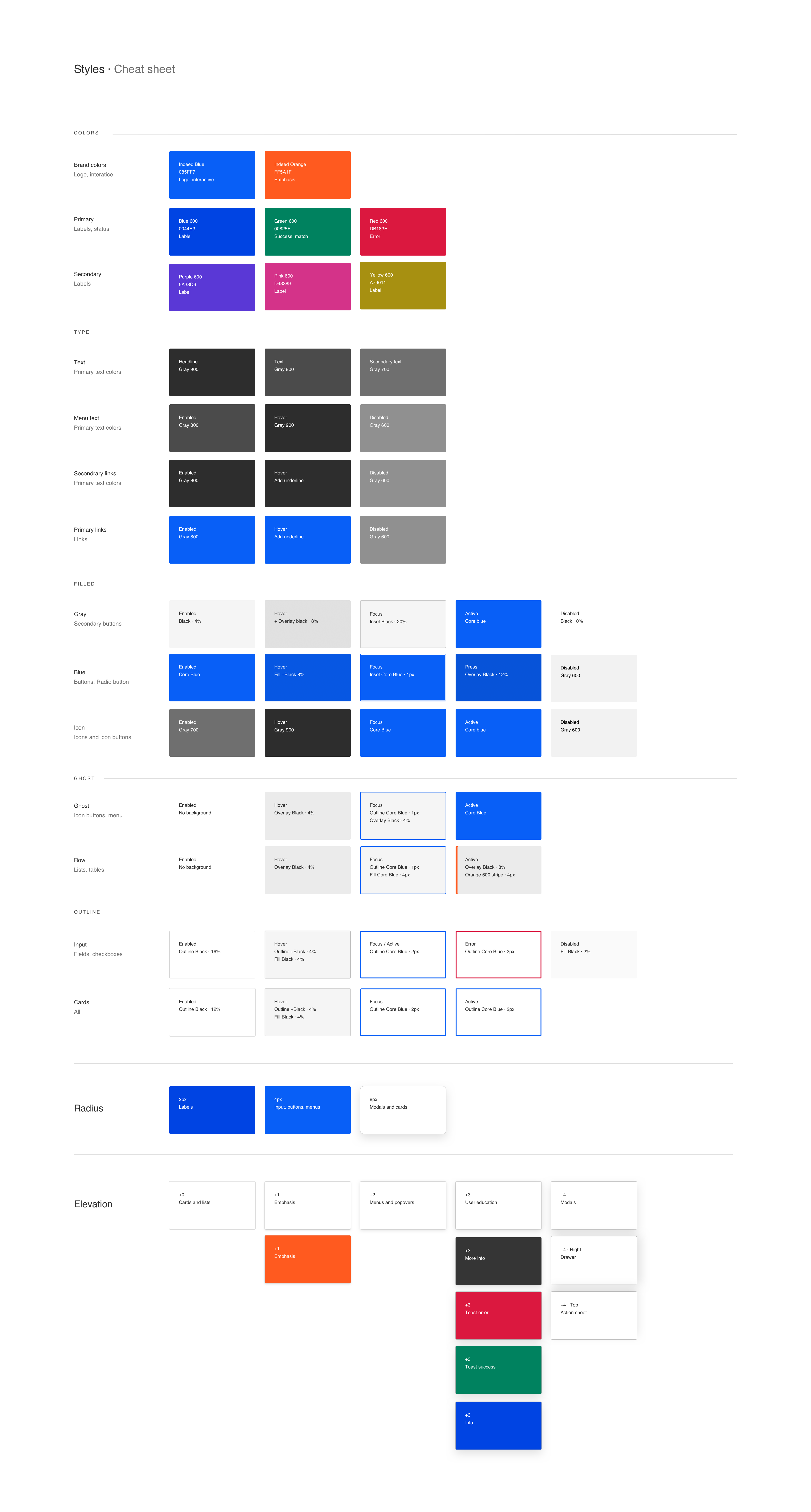
Usage guidelines were added to the colors to show different levels like brand, primary, and secondary colors. There are select colors that are available for text as well as component states and levels of elevation indicating error and success. This way, color can be used with more purpose and achieve consistency.
More Case Studies
Esther Lim
Product Designer
