Overview
PROBLEM
As an e-commerce website for a food subscription service, OceanBox was not generating a lot of customers. There were problems within the checkout flow and the confusing layout frustrated customers which lead to cart abandonment. The site was also lacking information about the company in general, most importantly about the subscription service which lead to a lack of trust in the brand.
OPPORTUNITY
Redesign the website to highlight the values of the brand for sustainable and fresh seafood while providing an improved checkout process that is easy to use.
ROLE
Lead Designer | Created a sitemap, designed wireframes and page layouts on Sketch. Provided creative direction for the photoshoot to replace all assets on the website. Worked with developers in building the website.
Team | Designer, Frontend and Backend Developers, Photographer, Content Strategist
Homepage
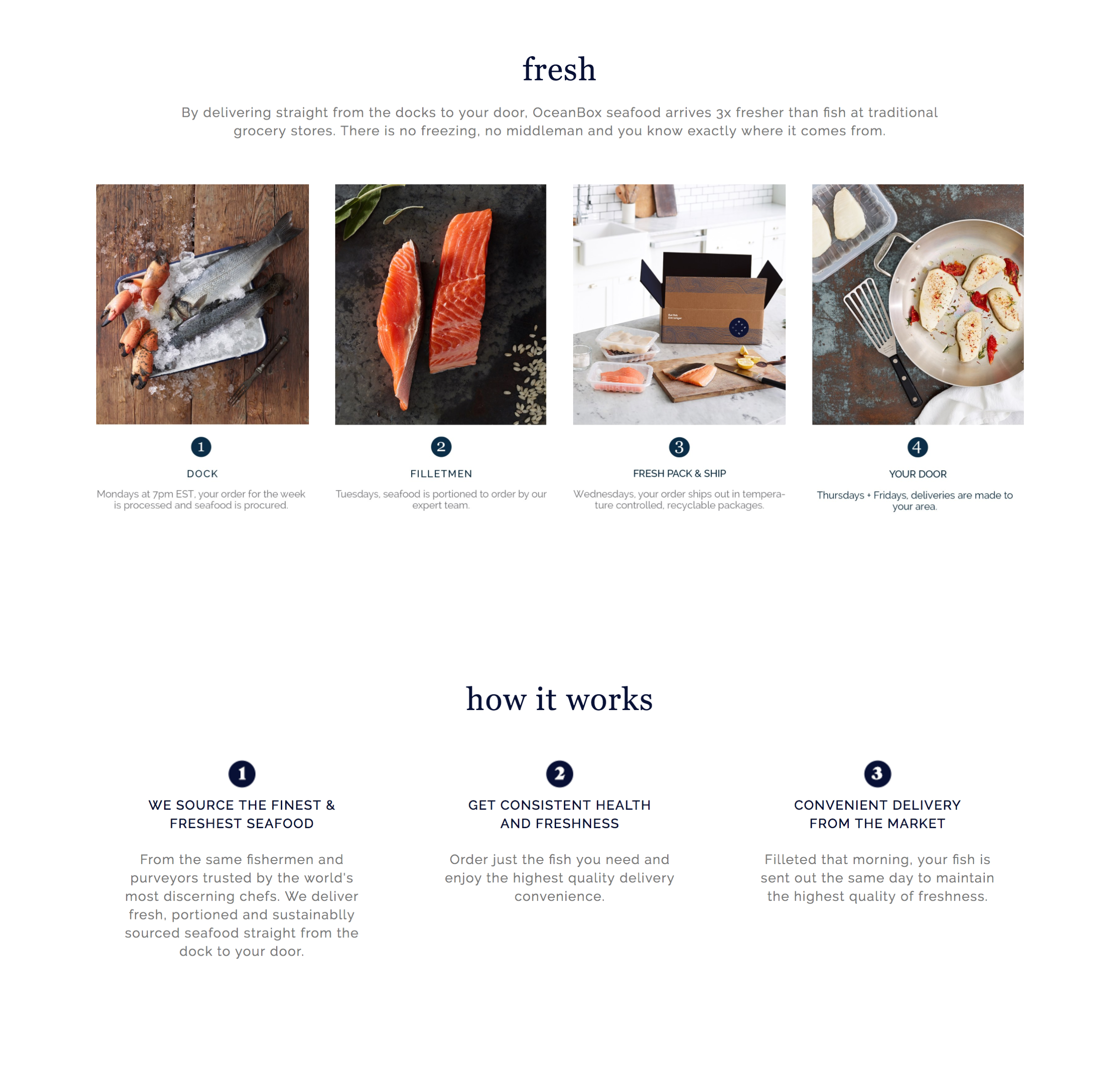
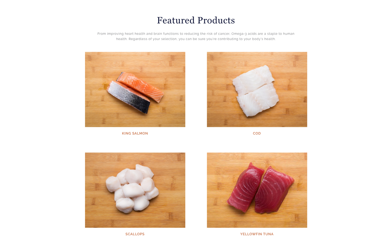
The goal of the homepage was to introduce customers to OceanBox as a brand and its values for sustainable and fresh seafood while educating on how the subscription service works.
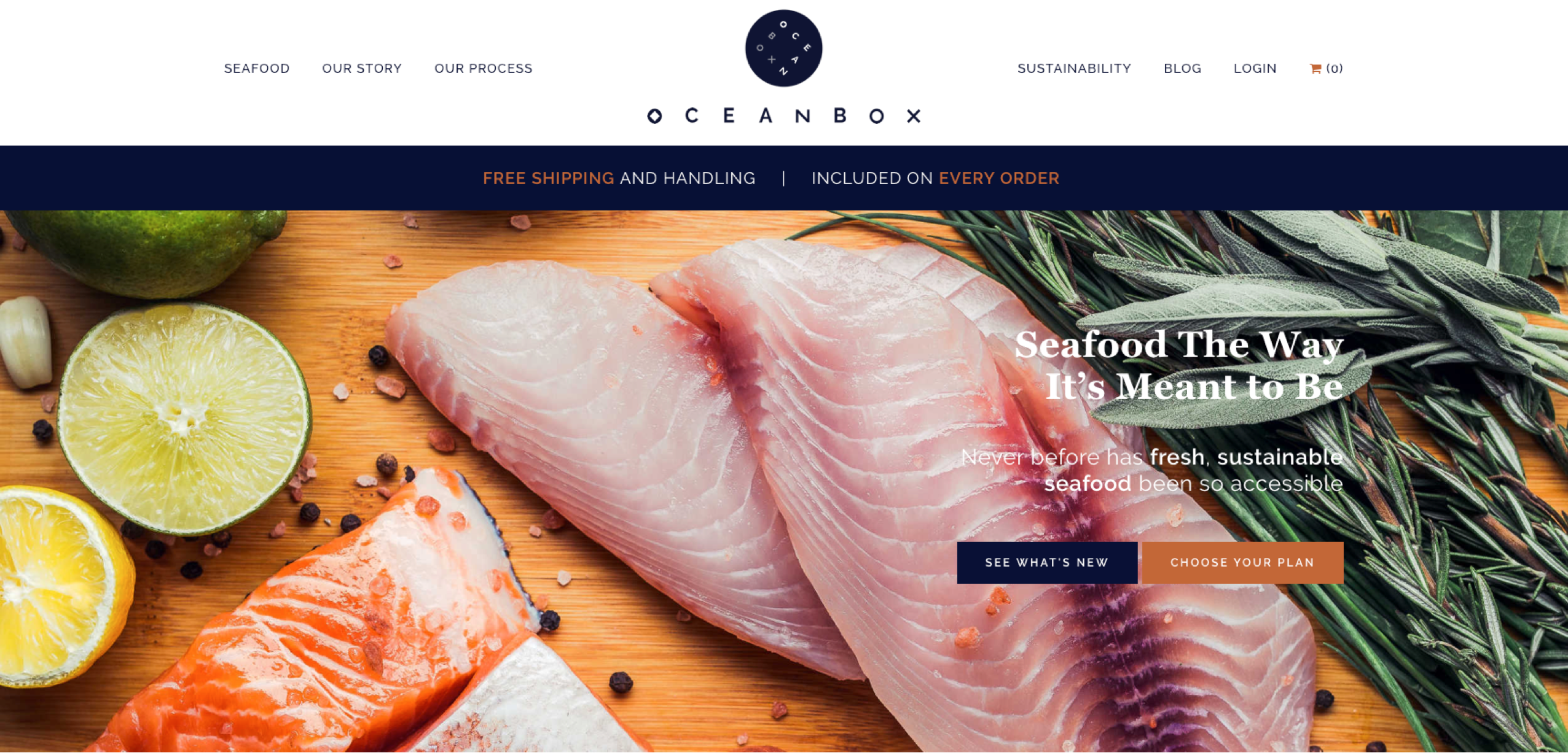
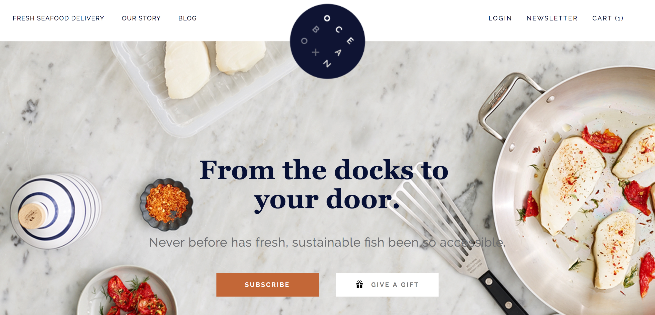
The most frequent feedback OceanBox received before the redesign was that the customers weren't aware that they were purchasing a subscription and were frustrated and confused when billed and sent another box the next month.
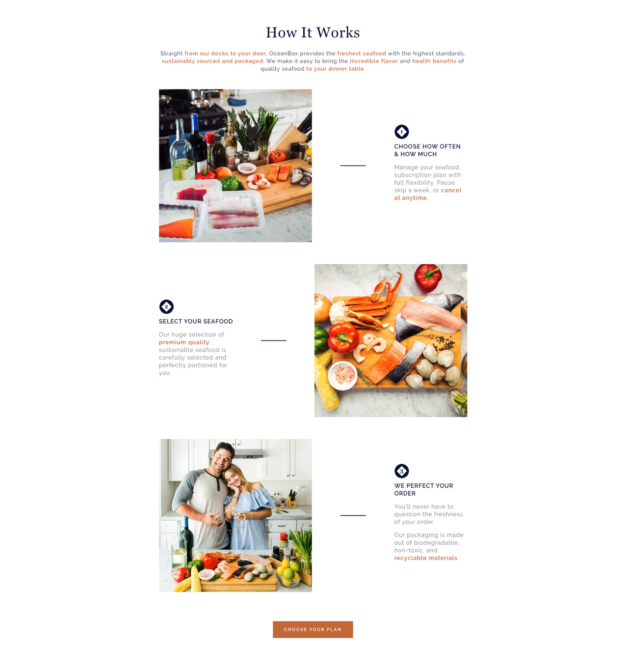
The "How It Works" section provides a step by step explanation of how the OceanBox subscription service works and gives an overview of the ordering process. The new layout improves the scannability and readability of the content.
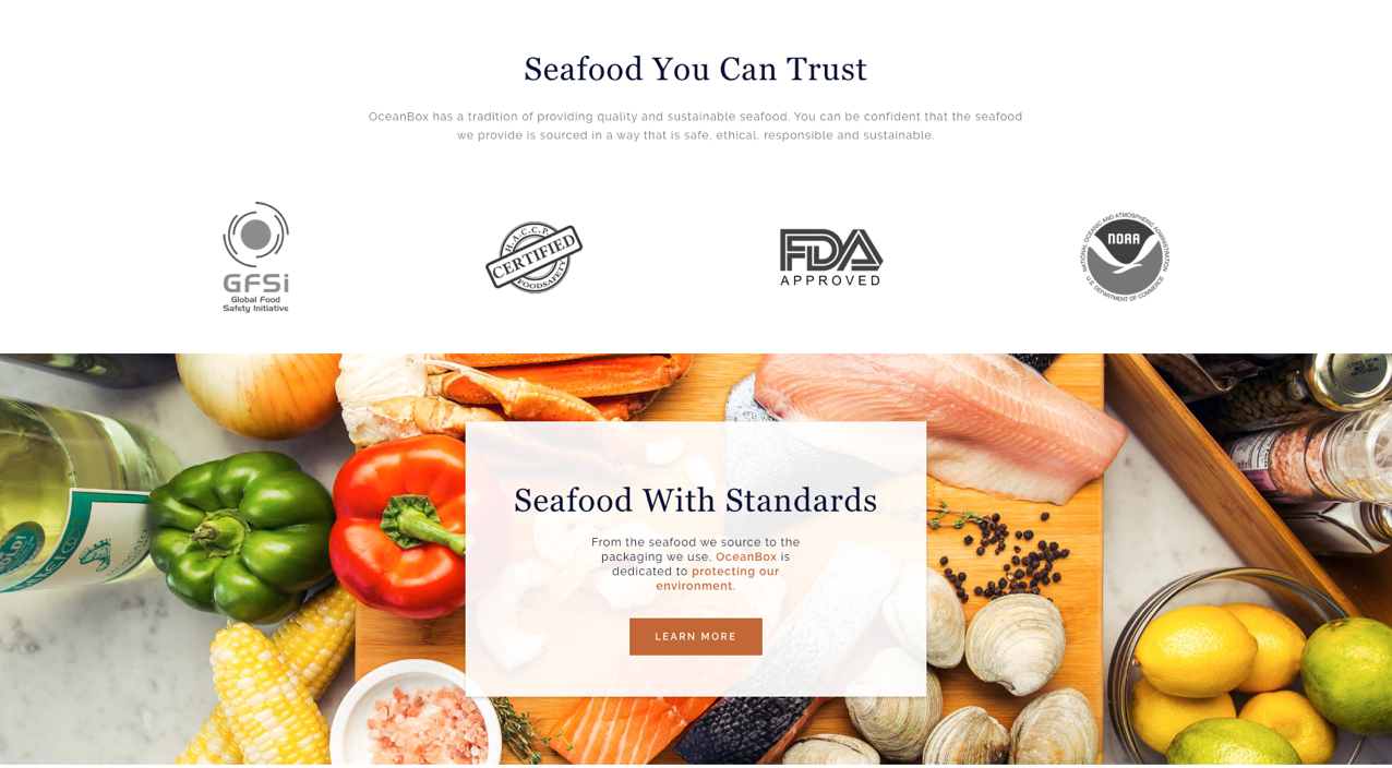
Sustainability held immense significance to the brand from its ethically sourced seafood to biodegradable and recyclable packaging. Consumers are more and more aware of the repercussions of unsustainable brands and it was important that the standards OceanBox uphold be highlighted to increase trust from customers.
Checkout
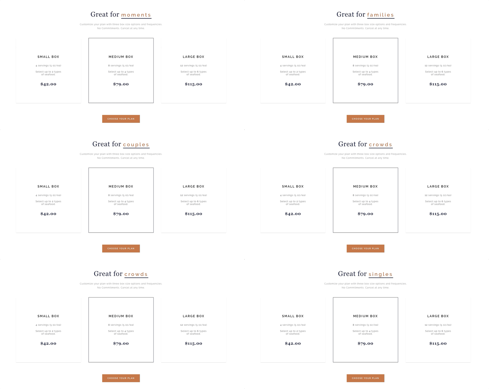
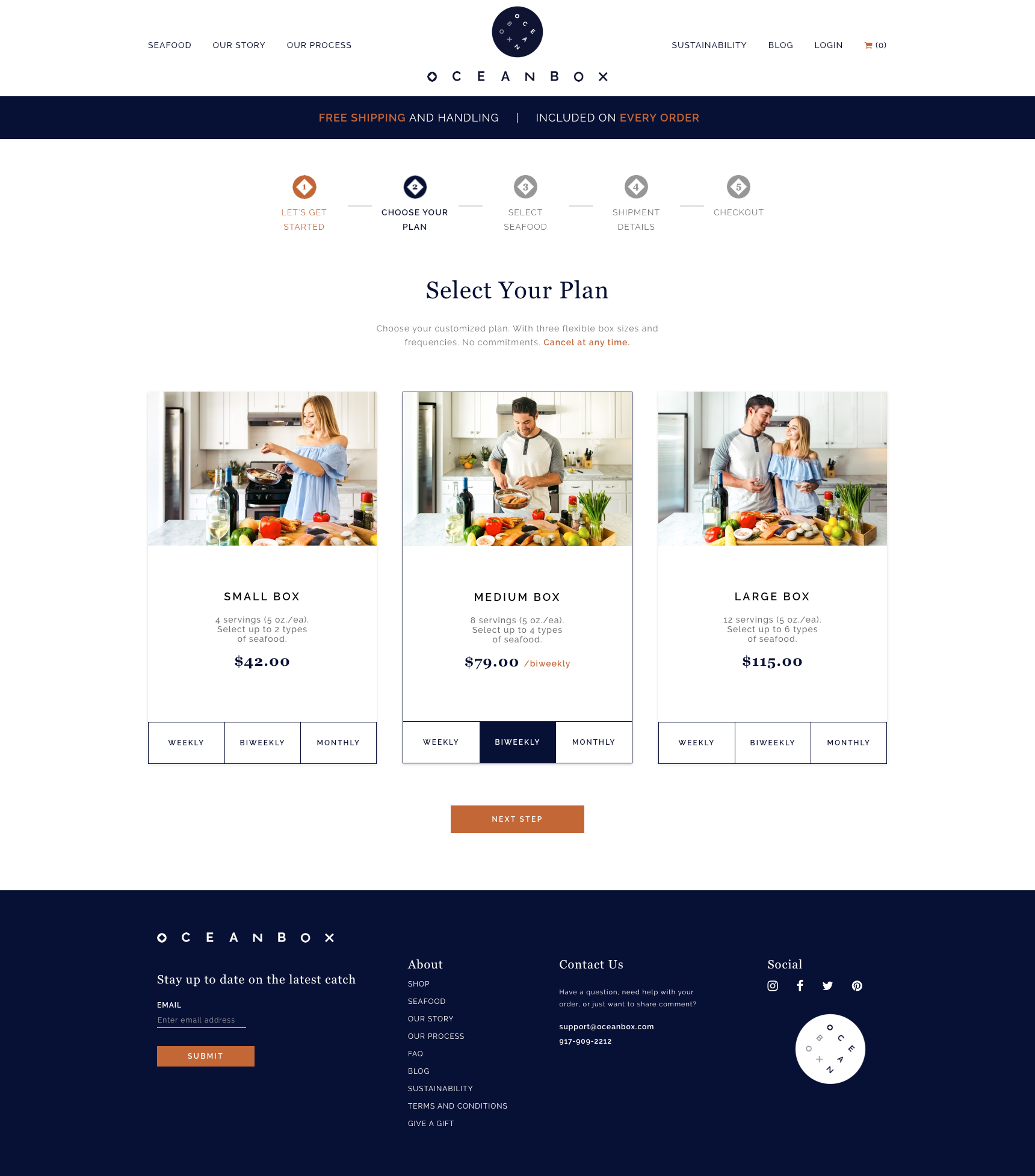
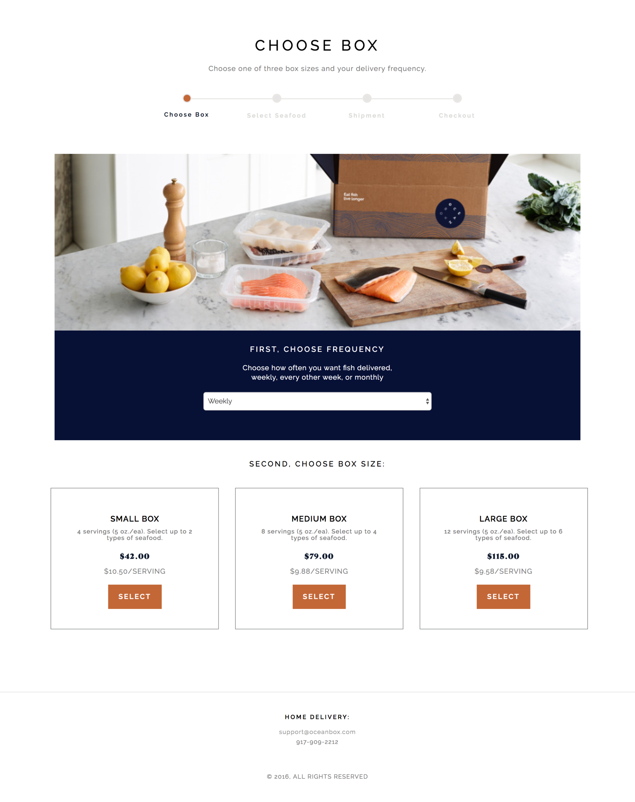
It's important for an e-commerce website to have a checkout flow that's effortless and pleasing. Instead of having two steps of selecting the frequency of deliveries and box size, I combined the two to make selecting a plan faster and easier. All the information needed is available with each selection from serving size, how many types of seafood are selectable, and the price of the plan based on the frequencies.
Next Steps
As a subscription service, it's important that OceanBox has a streamlined system that allows customers to view their order status, change deliveries or plans, and edit account information. As a business model dependent on retaining customer relationships, it's important that the reliable user experience is extended from the website to the user dashboard.
More Case Studies
Esther Lim
Product Designer
