Overview
PROBLEM
The United States is the biggest contributor to food waste in the world where 40% of the US food supply is wasted each year. The average American throws away 219 lbs of food which costs a family $1,600 annually making households responsible for the largest portion of the food waste.
The environmental impact of food waste is detrimental. Uneaten food is the single largest component of municipal solid waste and only 5% of it being composted, causing the breakdown to release large amounts of methane, a greenhouse gas that's up to 86 times more powerful than carbon dioxide. Food waste is also responsible for more than 25% of all freshwater consumption and a leading cause of freshwater pollution.
OPPORTUNITY
Create an app that makes it easier to tackle food waste in the home by providing more visibility into the fridge while tackling challenges at a consumer level.
Introduction
Mid-March of 2020, California issued a statewide stay-at-home order mandating all residents to stay home with the exception to go to an essential job or shop for essential needs. For the first time, I witnessed empty supermarkets. People were panic buying by the cart full and it got me thinking whether all that food would be fully used or end up going to waste. I knew it wasn't just happening in my neighborhood but cities all over the country which prompted me to learn more about food waste and its impact.
I knew that food waste in America was a big problem, but didn't know how big it really was until I saw the numbers and statistics myself. I had always linked food waste as part of the concern when it came to the 37 million people across the US suffering from food insecurity but never thought of food waste as an environmental issue. After I've been more informed on the matter, I looked back on my cooking and grocery shopping habits. I could definitely relate to the frustrations people faced with the challenges of food waste and with a pandemic at large, I needed to do better. But how?
Surely at a time where we have apps for everything, there was one that would provide solutions for resolving food waste at home packaged nicely with great experience and interface design. I however couldn't find that product, which prompted me to create my own.
Challenge
Food waste happens at large at the consumer level and takes up 40-50% of all food waste happening in the US estimating at 76 billion pounds each year. To figure out which features were needed in this app, I needed to learn about the main contributors to why food waste happens in the home.
SPOILAGE
Food spoilage is the biggest reason why so much food is being thrown out. Two-thirds of food waste at home is due to food not being used before it goes bad due to improper storage and lack of visibility in refrigerators.
DATE LABEL CONFUSION
More than 80% of Americans to discard food due to confusion between date labels because of inconsistent phrases like "sell by," "best if used by," and "expires by". To avoid risking consumption of spoiled food, people are throwing away perfectly fine products.
POOR PLANNING
When shopping without meal plans or shopping lists, consumers end up buying more ingredients than needed for the week, and the unplanned take out or delivery and restaurant meals result in those items spoiling before being used.
OVERBUYING
Due to impulsive food purchases encouraged by sales or promotions, many people end up buying more food than they really need or won't actually eat.
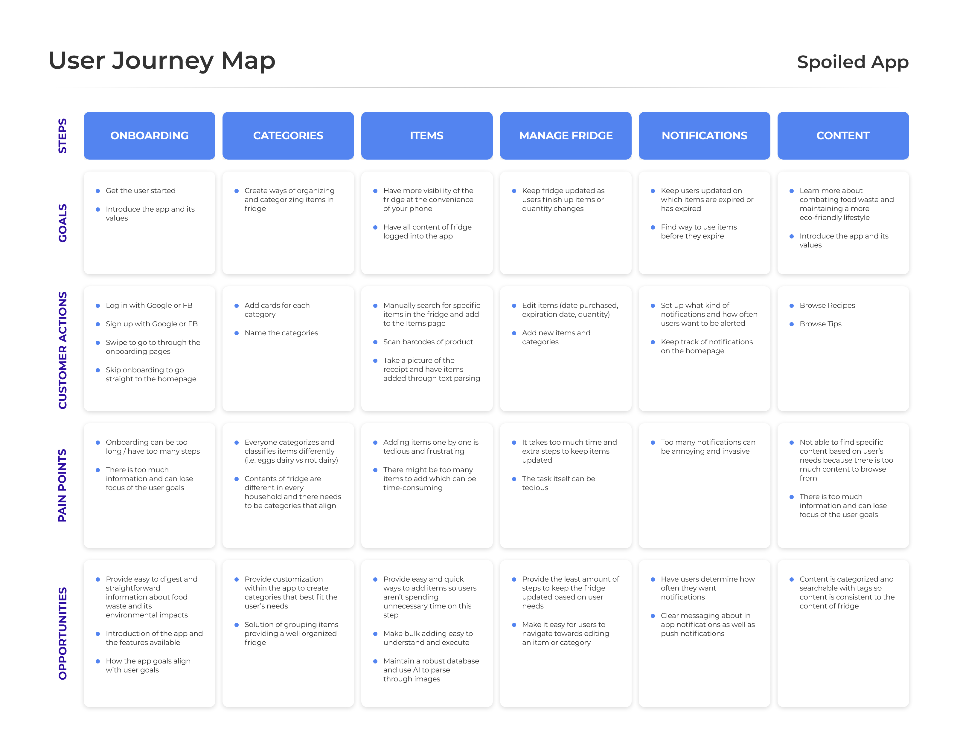
Journey Map
Using the challenges that Americans face that result in food waste, I decided to create a user journey map pinpointing what the goals, actions, frustrations, and opportunities are.
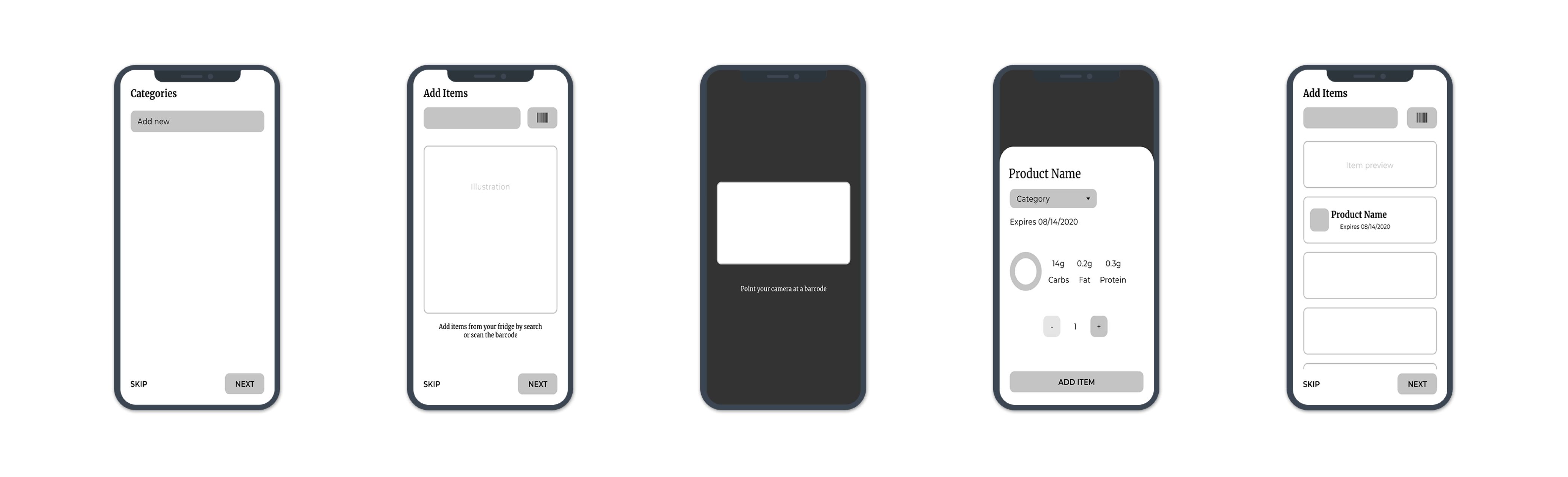
Wireframes
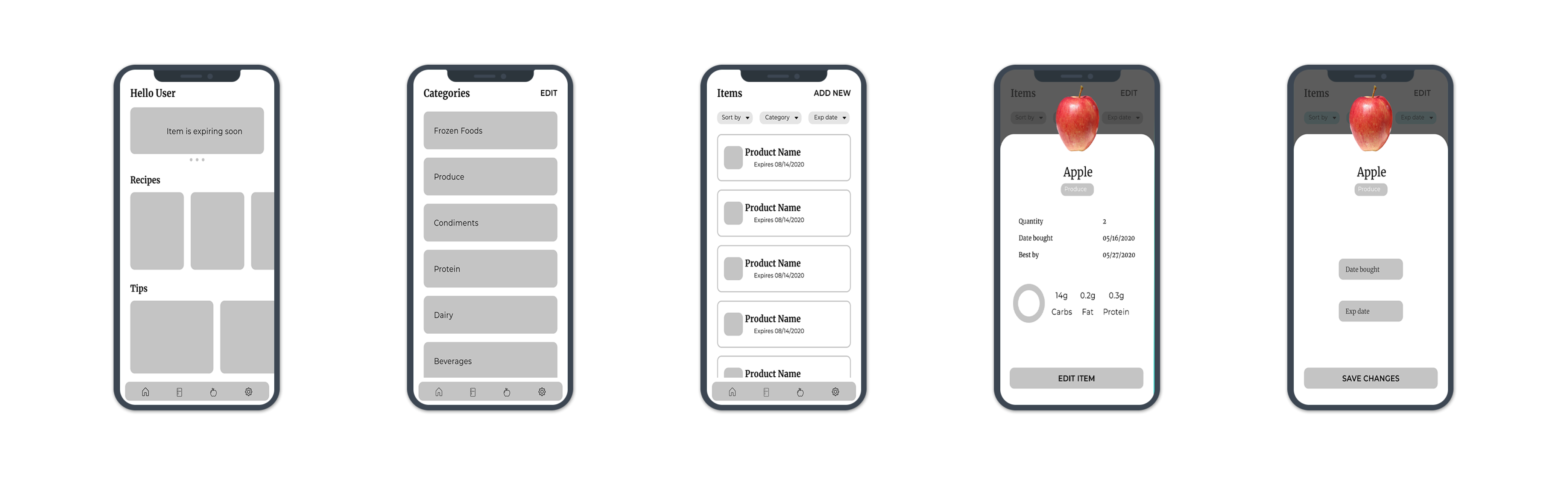
Now that the user tasks and goals were set, it was time to wireframe the different flows. Users can get started with the app by creating categories and adding items from the fridge. The manage fridge flow shows how users can keep up to date with their fridge contents by learning more recipes and tips on reducing food waste and editing items based on usage.
GETTING STARTED
MANAGE FRIDGE
Branding
UX TRENDS OF 2020
I wanted to do something a little different when it came to the overall branding and visuals. As a fun challenge for myself, I turned to the UX and App trends of 2020 as a starting point and see how I can interpret these trends for Spoiled's brand.
- Illustration
- Semi-flat design
- Contrasting, eye-catching colors
- Illustrations from ManyPixels
- Serif Fonts
- Provides visual hierarchy
- Use for headlines
- Futuristic Colors
- Purple, blue, pink
- Colors that don't appear in nature/earth
- Rounded Organic Shapes
- Imperfect and soft
- Imbalanced
- Personalization & Customization
- Curated content for users
Final Design
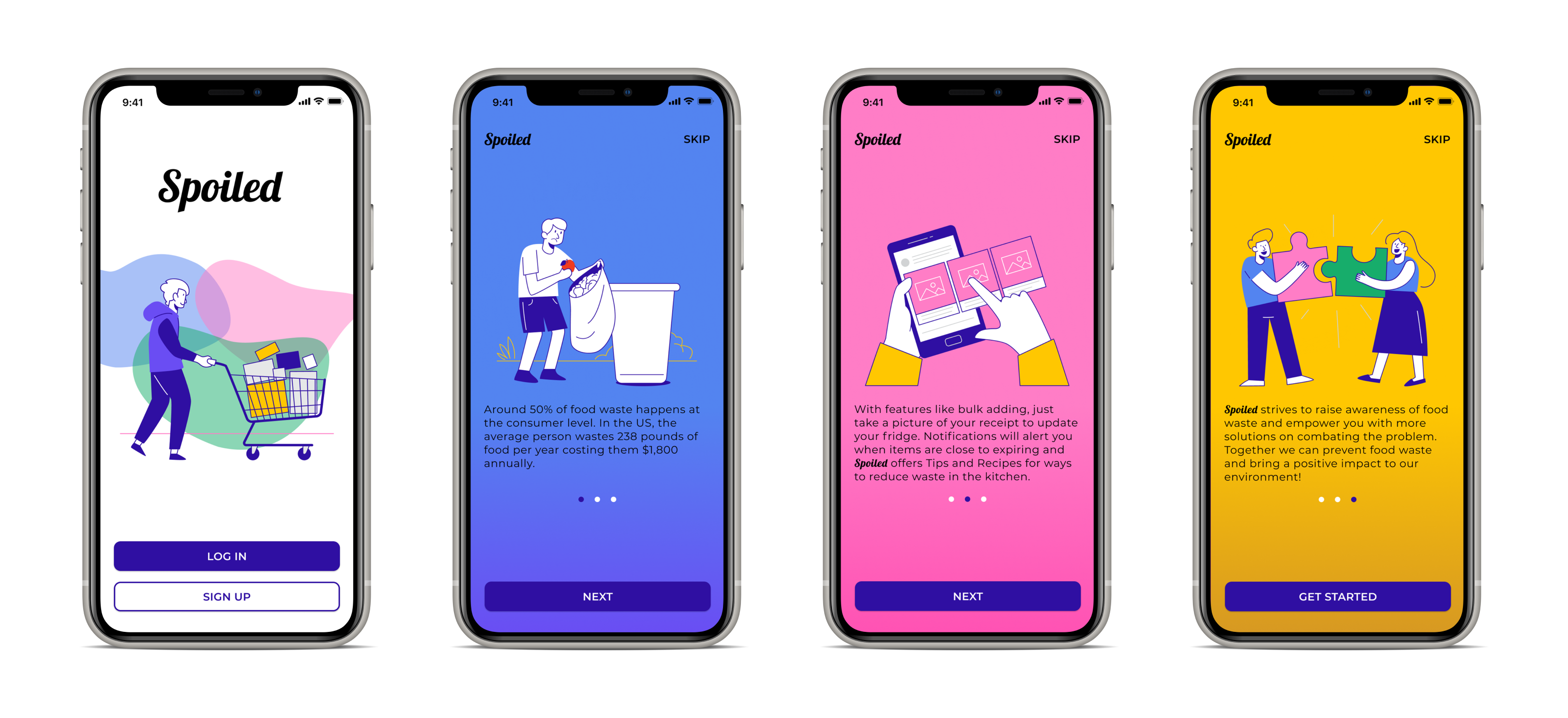
ONBOARDING
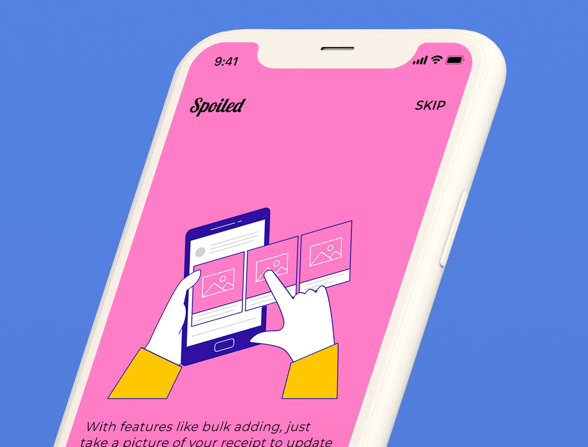
The onboarding process is the first interaction the user has with the app so I had more fun with the branding elements to set the tone and introduce the values of Spoiled. It starts off with a login and sign up page where users can either use their social media account or email to quickly register. The three screens following go in-depth of bringing awareness to food waste, the functionality of the app, and the core values of what the product stands for.
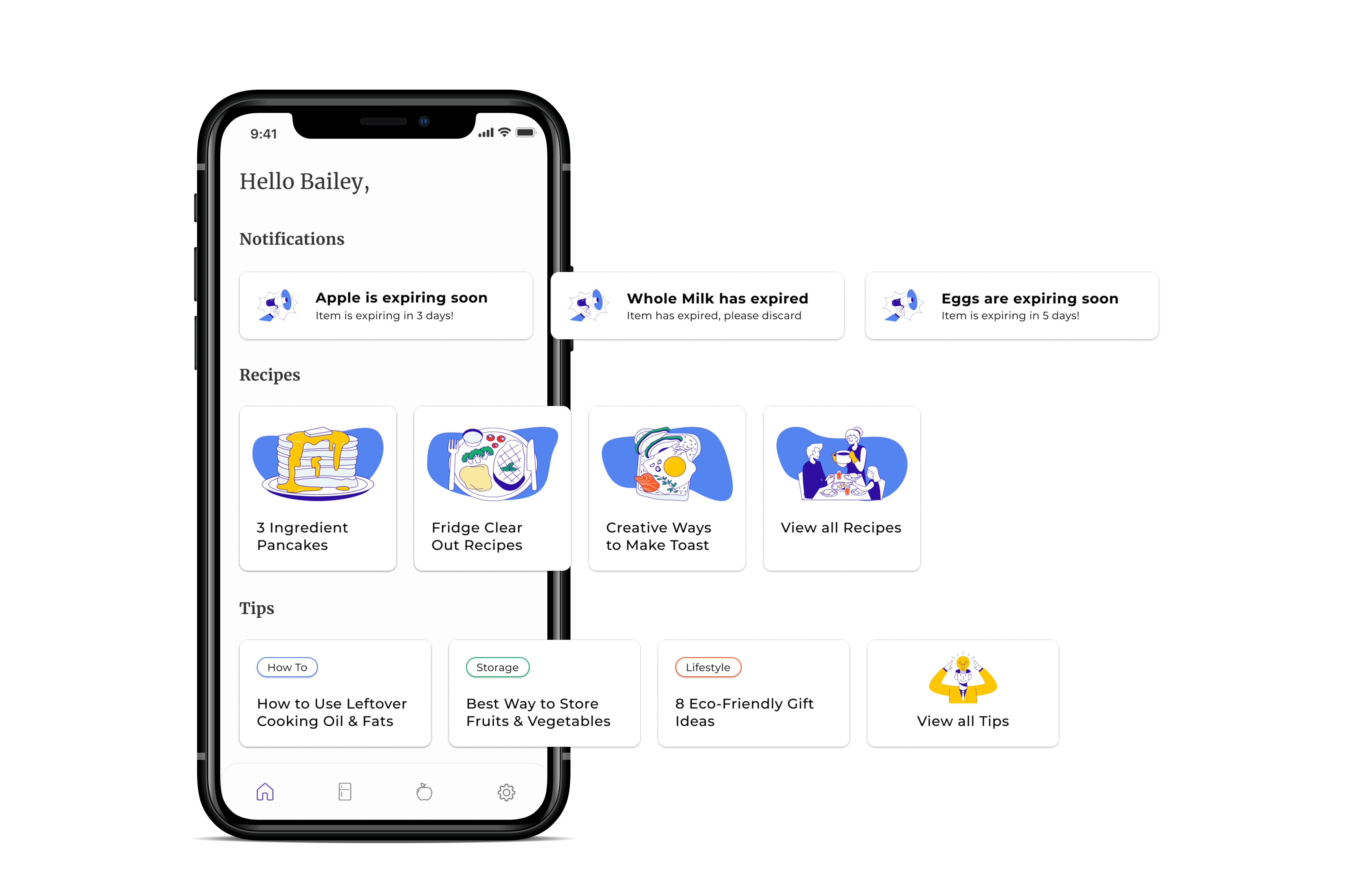
HOMEPAGE
The app homepage is where the user has access to all the notifications about their fridge contents as well as recipes and tips on how to reduce food waste at home. The content is based on the tags created by the items in the fridge and is curated specifically to the user creating a more personalized experience.
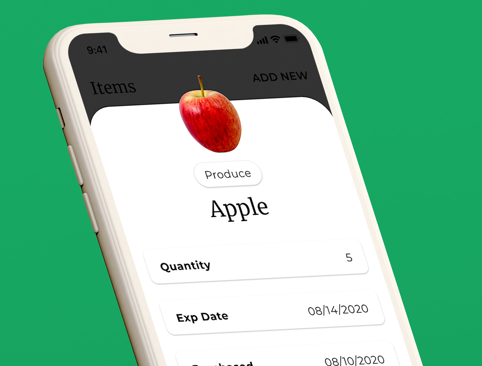
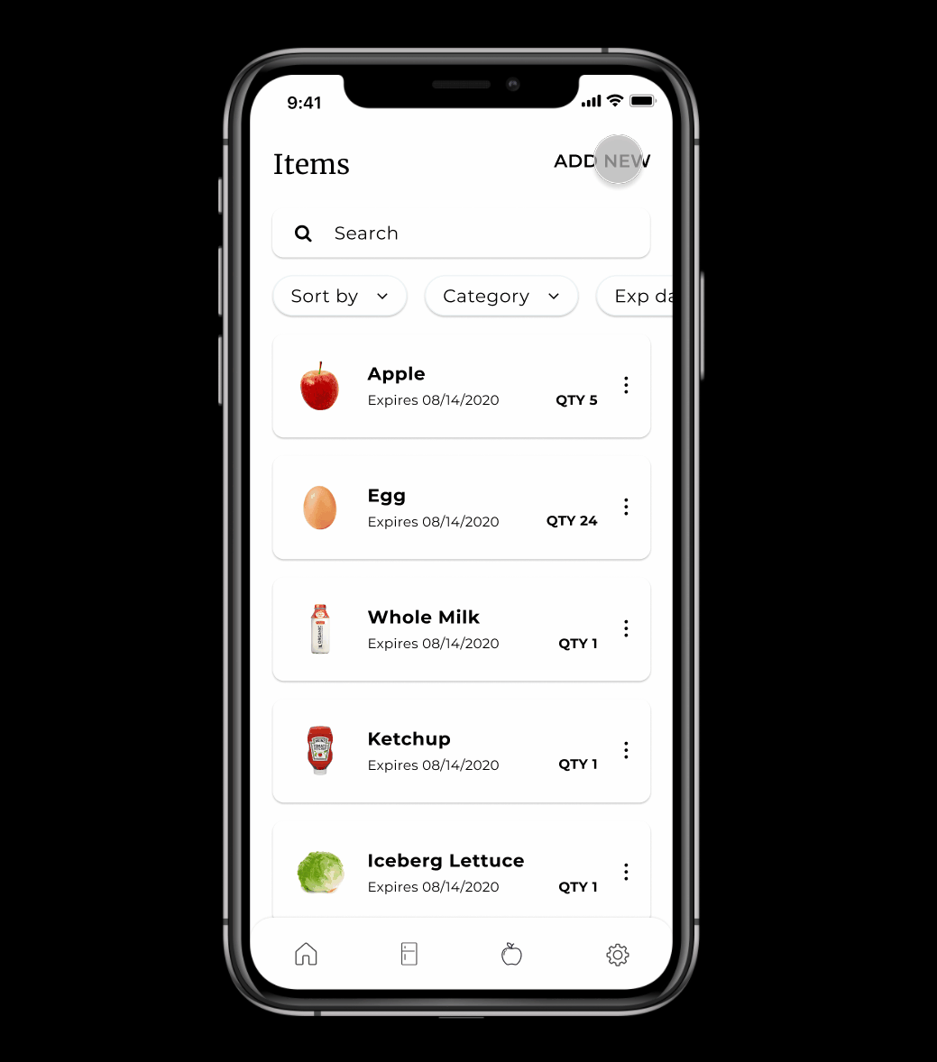
MANAGE FRIDGE
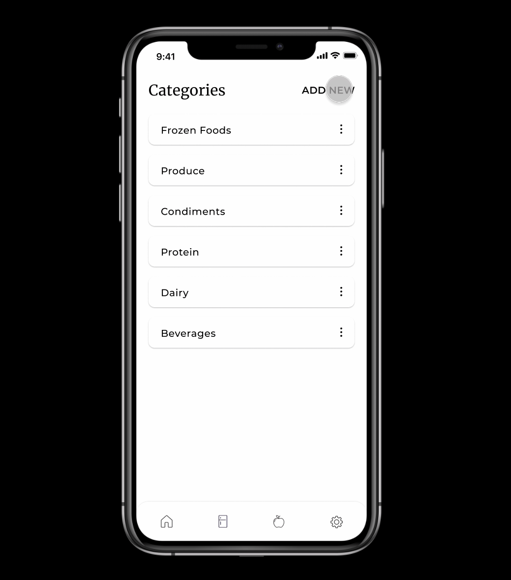
Everyone has different ways of categorizing items, so users are able to create their custom categories to help organize their fridge and make finding items quick and easy. This way when an item has been used and the quantity has to be edited, it won't take someone too long to finish the task.
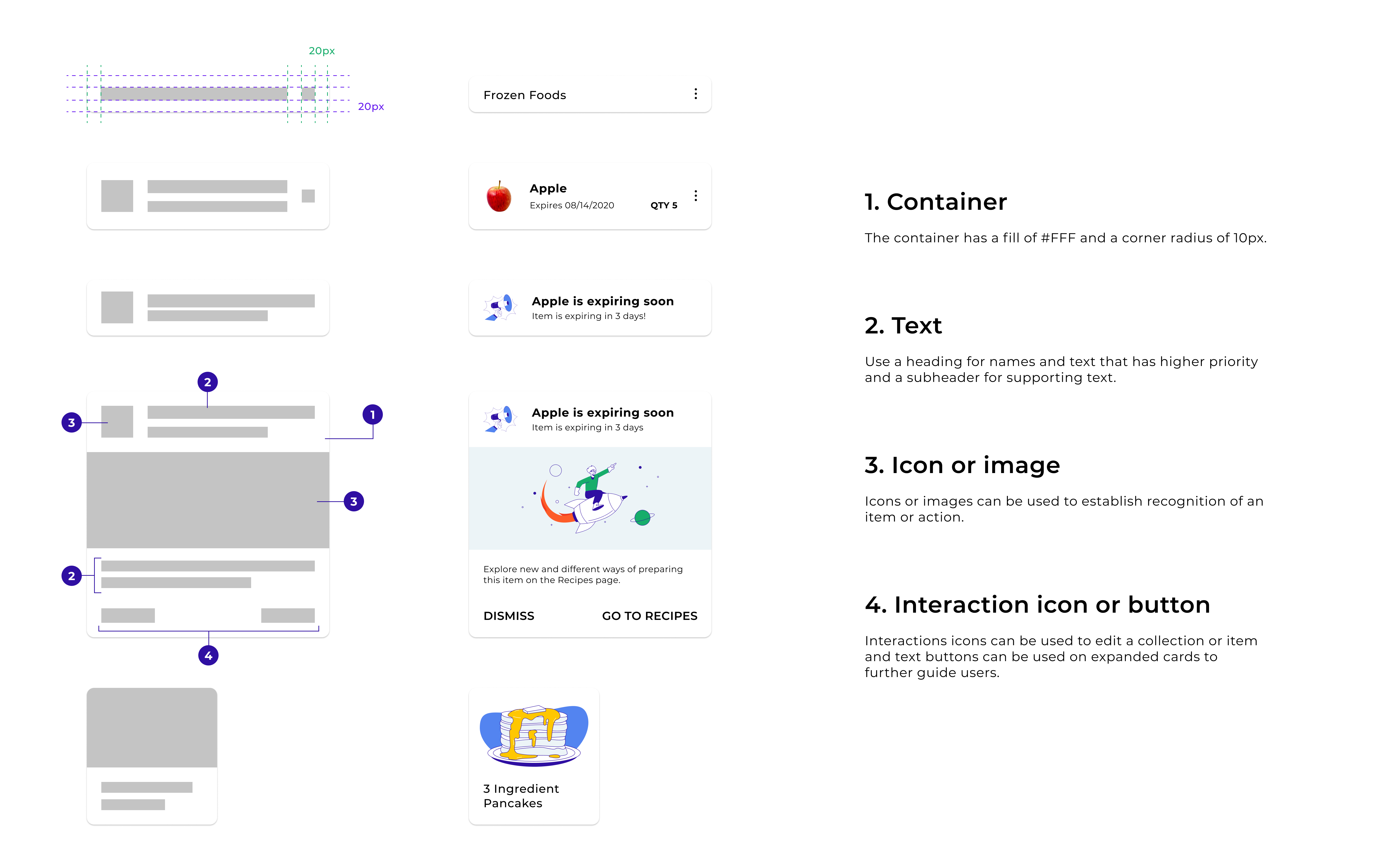
CARD DESIGN
Thinking more broadly about the app I knew there were going to be many different parts from the content, notifications to all the items in the user's fridge. I thought a card component would help create consistency in the design but also display the information more prominently. Depending on the contents of the component there are different levels of complexity using these four atomic pieces that make up the anatomy of each card.
ADDING ITEMS
There are three different ways of adding items to the app.
- Manual Search: Users are able to manually search for a specific product within their fridge and add the quantity and dates themselves.
- Scan Barcode: Add items by scanning the product barcode that automatically inputs the information that the barcode provides.
- Text Parsing: Inputting items one by one can be a menial and time-consuming task so an option for bulk adding needed to be included. By taking a picture of a receipt, the app is able to parse the text within the image and add multiple items in one step. Users are then able to edit through the rendered list.
PROTOTYPE
Here is an interactive prototype of the app created in Figma for an extensive view of features and overall experience of the product.
More Case Studies
Tags System - Design System
OceanBox - E-commerce Website
Esther Lim
Product Designer